If you saw a couple of my posts on LinkedIn you would have seen some of the things I have been doing to mess with SVGs, HTML, animation and in this initial case Pokémon. I wanted to build a way to be able to seamlessly transition from one colour background to another but in a smooth and animated way driven by slicers, and all linked to dax measures. So, this blog post will give you a quick and easy way to achieve Dynamic PowerBI Backgrounds,
Doing things this way means rather than relying on bookmarks, theme files to switch up colours or implement ideas such as dark mode we can instead add smooth transitions and make changes in a more dynamic way.
Most of the SVG files I have put together have been based on the previous SVG base code I built which can be found in my previous blog post:
Use SVG, HTML & CSS to enhance PowerBI reports – Home
Step 1: The measure
Firstly I configured the measure – this is currently linked to a simple table referencing the Background Type but this of course could be any of your values / data sets.
I have created two sets of colours relating to the selected option to show the two ends of the gradient. This means when we apply the animation we gain a subtle effect (of course you could just use a simple base colour).
To create a smoother transition between colours I have set all to initially show as a warm white colour, so instead of instantly performing a jarring switch, the screen goes light and slowly moves to the new selected colour. In my code I have also layered a slight vignette to the edges of the image to emphasise the display.
As part of this code it is also important to select the correct width and height to ensure the effect fills the screen (set the same as your PBI reports or at least the same aspect ratio such as 1920×1080 if using 16:9)
HTML_Dynamic_Back =
VAR selectedOption =
    // Get the selected background option, defaulting to "Light" if none is selected
    SELECTEDVALUE(BackgroundType[BackgroundType], "Light")

VAR gradientStart =
    // Define gradient start colours for each option
    SWITCH(
        TRUE(),
        selectedOption = "Light", "#F2EFE9",
        selectedOption = "Dark", "#1A1A1A",
        selectedOption = "Middle", "#A8A8A8",
        selectedOption = "Red", "#F08030",
        selectedOption = "Green", "#78C850",
        selectedOption = "Blue", "#6890F0",
        selectedOption = "Yellow", "#F8D030",
        selectedOption = "Orange", "#FFA500",
        "#6BFAD8"
    )

VAR gradientEnd =
    // Define gradient end colours for a lighter variation of each option
    SWITCH(
        TRUE(),
        selectedOption = "Light", "#FFFFFF",
        selectedOption = "Dark", "#575757",
        selectedOption = "Middle", "#D8D8D8",
        selectedOption = "Red", "#FFD6C1",
        selectedOption = "Green", "#E6FFE6",
        selectedOption = "Blue", "#E6F5FF",
        selectedOption = "Yellow", "#FFFFE0",
        selectedOption = "Orange", "#FFE6CC",
        "#FFFFFF"
    )

VAR warmOffWhite = "#F2EFE9" // A warm off-white base colour

VAR svg =
    // Construct the SVG with animated gradients and vignette effect
    "<svg xmlns='http://www.w3.org/2000/svg' width='1920' height='1080' preserveAspectRatio='none'>" &
    "   <defs>" &
    "       <linearGradient id='bg-gradient' x1='0%' y1='0%' x2='100%' y2='100%'>" &
    "           <stop offset='0%' stop-color='" & warmOffWhite & "'>" &
    "               <animate attributeName='stop-color' values='" & warmOffWhite & ";" & gradientStart & "' dur='4s' begin='0s' fill='freeze' repeatCount='1'/>" &
    "               <animate attributeName='stop-color' values='" & gradientStart & ";" & gradientEnd & ";" & gradientStart & "' dur='6s' begin='4s' repeatCount='indefinite'/>" &
    "           </stop>" &
    "           <stop offset='100%' stop-color='" & warmOffWhite & "'>" &
    "               <animate attributeName='stop-color' values='" & warmOffWhite & ";" & gradientEnd & "' dur='4s' begin='0s' fill='freeze' repeatCount='1'/>" &
    "               <animate attributeName='stop-color' values='" & gradientEnd & ";" & gradientStart & ";" & gradientEnd & "' dur='6s' begin='4s' repeatCount='indefinite'/>" &
    "           </stop>" &
    "           <animate attributeName='x1' values='0%; -20%; 0%; 20%; 0%' dur='15s' repeatCount='indefinite'/>" &
    "           <animate attributeName='y1' values='0%; -20%; 0%; 20%; 0%' dur='15s' repeatCount='indefinite'/>" &
    "           <animate attributeName='x2' values='100%; 120%; 100%; 80%; 100%' dur='15s' repeatCount='indefinite'/>" &
    "           <animate attributeName='y2' values='100%; 120%; 100%; 80%; 100%' dur='15s' repeatCount='indefinite'/>" &
    "       </linearGradient>" &
    "       <radialGradient id='vignette-gradient' cx='50%' cy='50%' r='75%' fx='50%' fy='50%'>" &
    "           <stop offset='0%' stop-color='black' stop-opacity='0'/>" &
    "           <stop offset='60%' stop-color='black' stop-opacity='0'/>" &
    "           <stop offset='80%' stop-color='#575757' stop-opacity='0.02'/>" &
    "           <stop offset='100%' stop-color='#575757' stop-opacity='0.1'/>" &
    "       </radialGradient>" &
    "   </defs>" &
    "   <rect width='1920' height='1080' fill='url(#bg-gradient)'/>" &
    "   <rect width='1920' height='1080' fill='url(#vignette-gradient)'/>" &
    "</svg>"

RETURN
    "data:image/svg+xml;utf8," & svg
Step 2 : The Card
In this step we need to setup the card to be able to apply the measure. As with my other examples I have been using the new card visual.
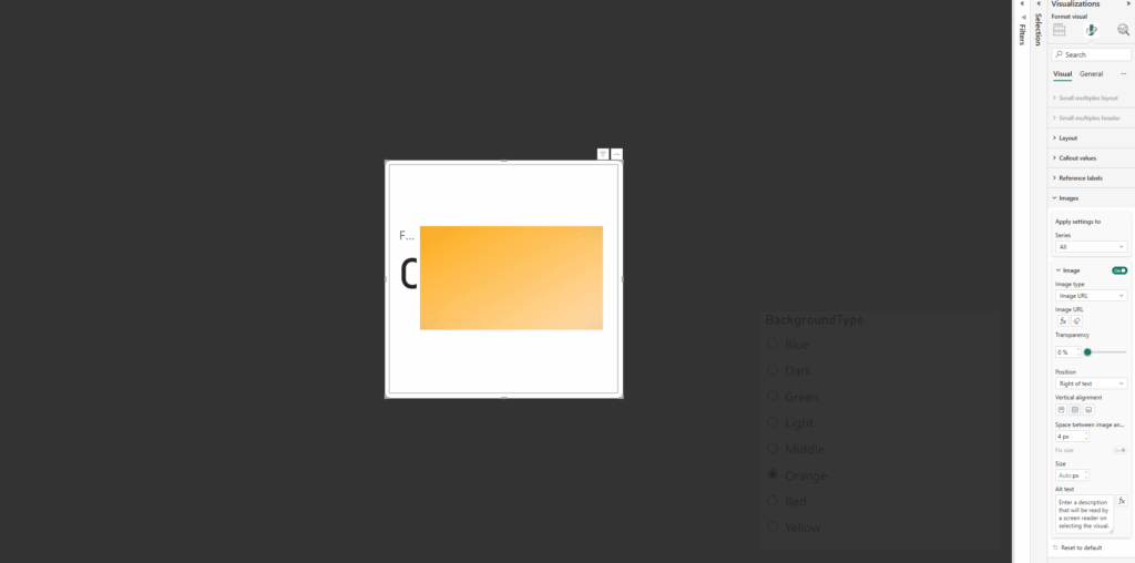
Firstly, on the card, apply the measure under the image section.
- Select Image URL
- Select the measure
- Add a column / value to the card to the Data parameter (any is fine we are going to remove this from view)

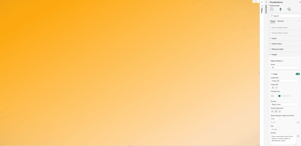
Next we need to resize the card to the full size of the window (or at least the area wanting to use) and then disable the values / labels under the Callout values section:
- Disable Values
- Disable Label
Now all padding needs to be removed from the card as well as removing all existing backgrounds / style effects
Under Visual / Cards:
- Disable Background
- Disable Border
- Change Padding to custom and set all to 0px
Under Visual / Images
- Change Space between Image and callout to 0px
Under General / Effects
- Disable Background
- Under General / Properties
- Set all Padding to 0px

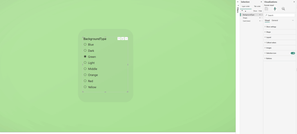
Now to test – I’ve added a slicer to switch between the different colours in my measure for example
To get the best effect from the dynamic background I have set a level of transparency to the visuals (if not dynamically changing these colours too)

Thanks for reading! Please have a play and let me know what cool things you make! Some actual use cases so far: enhancing UI / UX, a way to light mode / dark mode or accessibility options!
