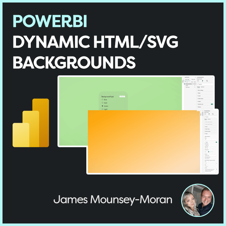
Creating Animated Line Charts in Power BI can be done in several ways. The most common approaches are using SVGs with measures and cards, or leveraging 3rd-party custom visuals that render HTML. While SVGs combined with a card look visually impressive, they often lose some of the interactivity we expect from native visuals such as tooltips.
To solve this, we can combine native visuals with SVGs, layering them together to create animated line charts that retain interactivity.
For this method, we’ll use:
- A line chart supported by measures that provide the line itself plus space above and below it.
- An animated SVG background placed behind the chart.
Step 1: Create the measures
For this example, we’ll use a dataset that tracks costs over time. We need three measures to build our animated line chart
Measure 1 (The actual cost)
This initial measure will simply be the actual value, so the cost column. In this instance I have just loaded into a measure called [COST]
COST = SUM(ProductSales[Cost])Measure 2 (The Line)
To create the line we want to highlight, we need it to sit just above the actual cost. We do this by creating a new measure that takes the cost for each date and returns 4% of it, making a thin but visible line on the chart.
COST_LINE = MAXX(ALLSELECTED(ProductSales[Month]),[COST])*0.04Measure 3 (The top space)
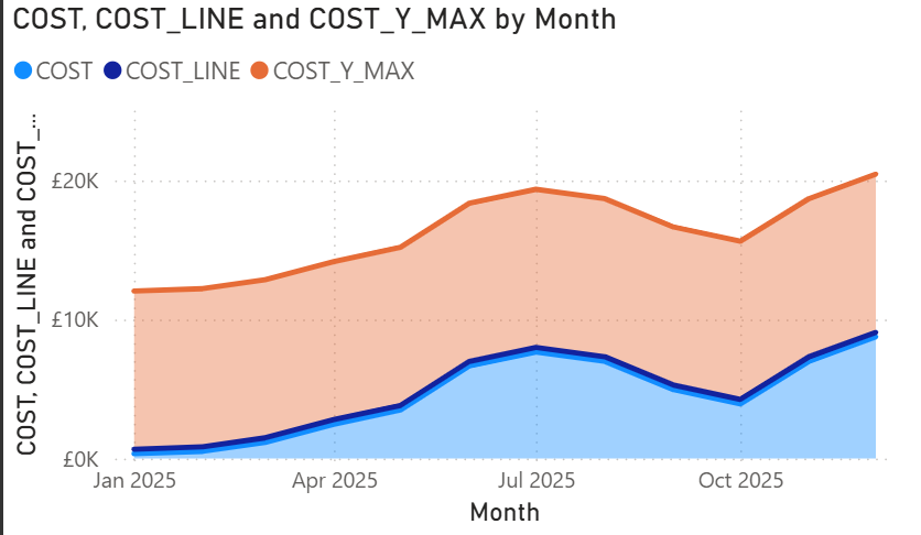
The final measure fills the remaining space on the Y axis. This makes the chart look full while leaving about 30% of space above the line. We implement this measure as follows
COST_Y_MAX = MAXX(ALLSELECTED(ProductSales[Month]),[COST])*1.3Step 2: Build the stacked area chart
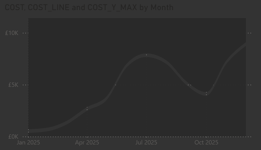
With the measures in place, we can start building the visual. The steps below show how to use the measures to create the chart.
- Add a Stacked Area Chart
- On the Y axis, add the three measures in this order: COST, COST_LINE, COST_Y_MAX
- On the X axis add a Date column from your dataset
Once added, your chart should look something like the example below.
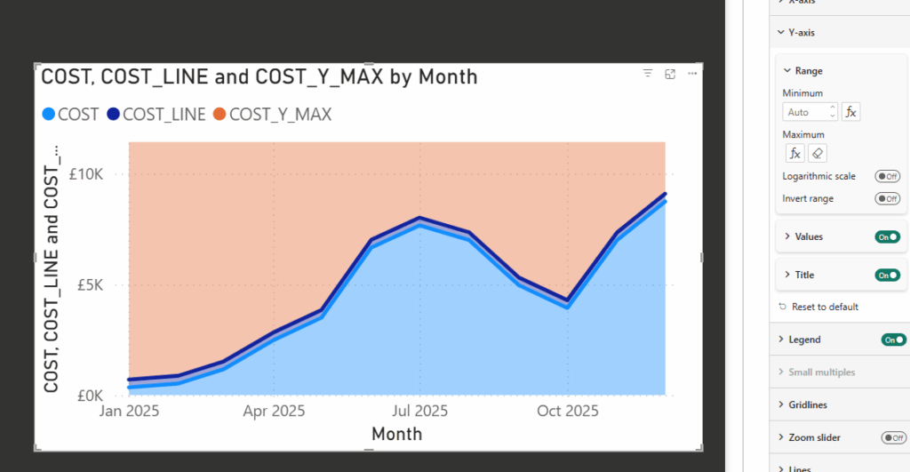
Next, we need the COST_Y_MAX measure to fill the top part of the chart. To do this:
- Select the visual and go to Y Axis, Range.
- Set the maximum value to COST_Y_MAX.
This ensures the chart fills the Y axis correctly and leaves space above the line.
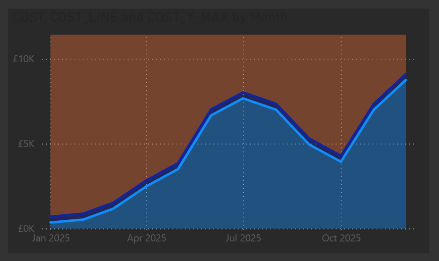
Step 3: Format the chart layers
Now that we have the basic chart, it’s time to set up the visual elements that will support the layers behind it.
- Select the visual and disable the legend.
- Under X & Y Axis, disable the titles (optional if you don’t need them).
- Under General, Background, choose a background color. In this example, I’ve used #292929. Make a note of this, as we’ll be turning the background off later.
After these changes, your visual should look something like this:
Next we need to use that same background for our shade areas and lines
- Under Lines
- Select the COST_Y_MAX Series and untick show for this series
- Select the COST Series and untick show for this series as well
- Under Shade Area
- Select the COST_Y_MAX Series, untick match line color
- Set the Color to the same as your background color (e.g. #292929) and set transparency to 0%
- Select the COST Series and again untick match line color
- Set the Color to the same as your background color (e.g. #292929) but this time set transparency to 5%
- Select the COST_LINE Series and uncheck Show for this Series
That should now give us the following
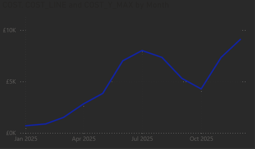
Since we used the other measures to hide parts of the chart, the next step is to fully configure the line area we want to display.
- Under Line, with Series All selected, set the Interpolation Type to Smooth and the Smooth type to Monotone.
- Under Line, select COST_LINE and uncheck Show for this series.
- Finally, go to General, Effects, Background and turn the background off.
This prepares the chart so the animated SVG we’ll add behind it will show correctly.
At this point, our visual is ready for the SVG animation to be added behind it.
For the background, I’ve used the same dynamic SVG setup from a previous post, but applied a different animation in the measure. The steps below show the updated animation code.
Step 4: Create the SVG measure
Next, we create a measure to generate the animated SVG background. This measure lets us pick different colors or gradients dynamically and animates a rectangle across the visual.
HTML_Dynamic_Line =
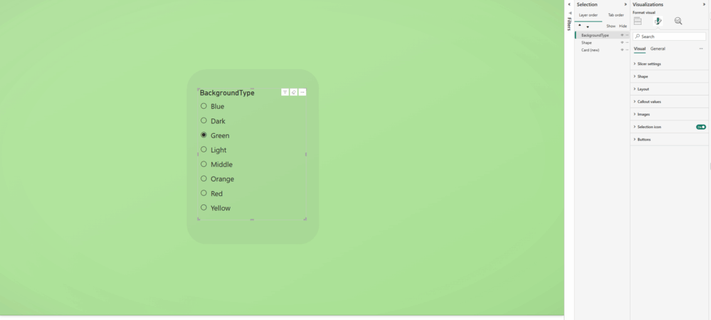
VAR selectedOption =
SELECTEDVALUE(BackgroundType[BackgroundType], "Light")
VAR fillColor =
SWITCH(
TRUE(),
selectedOption = "Light", "#F2EFE9",
selectedOption = "Dark", "#1A1A1A",
selectedOption = "Middle", "#A8A8A8",
selectedOption = "Red", "#f03030",
selectedOption = "Green", "#78C850",
selectedOption = "Blue", "#6890F0",
selectedOption = "Yellow", "#F8D030",
selectedOption = "Orange", "#FFA500",
selectedOption = "Gradient", "url(#red-yellow-green)",
"#6BFAD8"
)
VAR svg =
"<svg xmlns='http://www.w3.org/2000/svg' width='1920' height='1080' preserveAspectRatio='none' viewBox='0 0 1920 1080'>" &
" <defs>" &
" <linearGradient id='red-yellow-green' x1='0%' y1='100%' x2='0%' y2='0%'>" &
" <stop offset='0%' stop-color='#f03030'/>" &
" <stop offset='42%' stop-color='#f03030'/>" &
" <stop offset='46%' stop-color='#F8D030'/>" &
" <stop offset='54%' stop-color='#F8D030'/>" &
" <stop offset='58%' stop-color='#78C850'/>" &
" <stop offset='100%' stop-color='#78C850'/>" &
" </linearGradient>" &
// Vignette definition
" <radialGradient id='vignette-gradient' cx='50%' cy='50%' r='75%' fx='50%' fy='50%'>" &
" <stop offset='0%' stop-color='black' stop-opacity='0'/>" &
" <stop offset='60%' stop-color='black' stop-opacity='0'/>" &
" <stop offset='80%' stop-color='#575757' stop-opacity='0.02'/>" &
" <stop offset='100%' stop-color='#575757' stop-opacity='0.08'/>" &
" </radialGradient>" &
" </defs>" &
// Animated rectangle fill
" <rect width='0' height='1080' fill='" & fillColor & "'>" &
" <animate attributeName='width' from='0' to='1920' dur='3s' fill='freeze' />" &
" </rect>" &
// Vignette overlay
" <rect width='1920' height='1080' fill='url(#vignette-gradient)'/>" &
"</svg>"
RETURN
"data:image/svg+xml;utf8," & svg
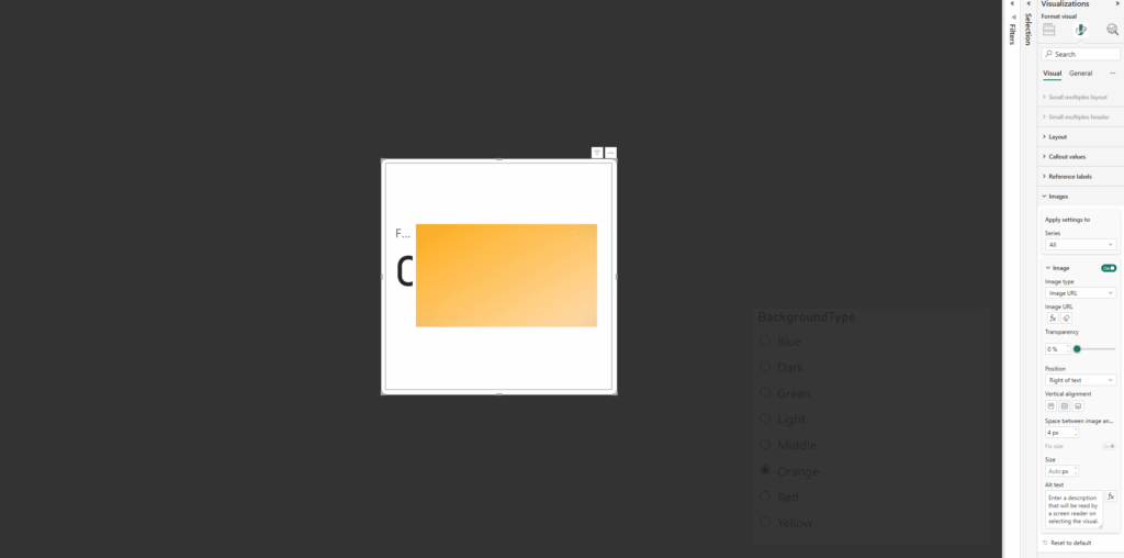
Step 5: Add the card visual
In this step we need to setup the card to be able to apply the measure. As with my other examples I have been using the new card visual.
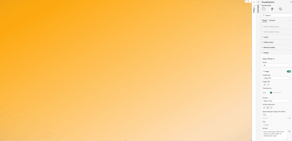
Firstly, on the card, apply the measure under the image section.
- Select Image URL
- Select the measure
- Add a column / value to the card to the Data parameter (any is fine we are going to remove this from view)
Next we need to resize the card to the full size of the window (or at least the area wanting to use) and then disable the values / labels under the Callout values section:
- Disable Values
- Disable Label
Now all padding needs to be removed from the card as well as removing all existing backgrounds / style effects
Under Visual / Cards:
- Disable Background
- Disable Border
- Change Padding to custom and set all to 0px
Under Visual / Images
- Change Space between Image and callout to 0px
Under General / Effects
- Disable Background
- Under General / Properties
- Set all Padding to 0px
Once added we should now have the two components, the visual we built and the card with the animated background
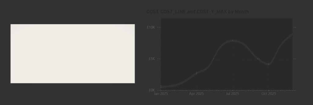
Step 6: Layer the visuals together
Now for the fun part. We need to place the animated card behind the visual and resize it so it matches the border of the background color we applied to the top and bottom of the chart.
Once positioned correctly, the animation will show through, and you may notice it animate a few times as you adjust the sizing.
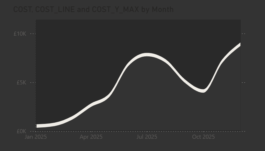
Final polish
And that is it. Everything is in place. The visual, the animated background, and the measure controlling it. You can have the animation show a single color, a gradient, or any variation you like. I have tried a few different options myself as you might have seen on my LinkedIn.
Once it was set up, I tidied the visual by adjusting the title and axes, turning off the gridlines, and adding a custom tooltip. Using the built-in tooltips would have shown all the extra measures we added, so the custom tooltip keeps it clean and focused.