Tag: powerbi

  • Adding a dynamic and animated Clear Slicers SVG button

    Adding a dynamic and animated Clear Slicers SVG button

    In Power BI it’s not always obvious when slicers are still applied. Sure, you can clear them with a button but wouldn’t it be better if you had a HUD that told you at a glance and worked in a more dynamic fashion? That’s what we’ll build in this post, a dynamic and animated Clear Slicers SVG button!

    One of the main reasons for a HUD (heads up display) is to be able to quickly view the state of play. Now naturally as part of PowerBI we have multiple reports that utilise all sorts of filters and slicers applied to our data, and often have additional slicers on reports to change the data or filter on something specific.

    When using reports though, it can sometimes be difficult to know if a slicer is still applied and of course PowerBI has built in functionality to clear all slicers. This then became an ideal thing to display on a HUD.

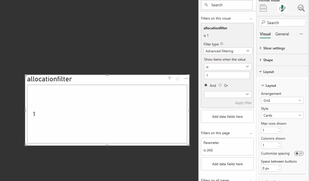
    The ability to clear all applied is the easy part as I mentioned earlier, this is already part of PowerBI as button functionality. What we need is a measure to be able to detect when slicers are applied so we can use it as part of our SVG code (similar to when we are building cards and all the other fancy things built using SVG)

    The measure I’ve put together looks like this and how it works is pretty simple!

    FilterStateMonitor = 
    VAR TABLE_1 = IF(COUNTROWS(ALLSELECTED(table1)) < COUNTROWS(ALL('table1')), 1, 0)
    VAR TABLE_2 = IF(COUNTROWS(ALLSELECTED('table2')) < COUNTROWS(ALL('table2')), 1, 0)
    RETURN
    IF(TABLE_1 + TABLE_2 > 0, 1, 0)
    

    In this example I have just loaded in a couple of tables. If you have more you want to monitor then just add as additional VARs and add to the final IF statement.

    But essentially it:

    • Checks how many rows are currently selected out of the table
    • Compares this to the total rows in the table

    If this doesn’t match then it will set the variable to 1, or effectively flagging that a table is filtered.

    What we can do next is then use this as part of a SVG measure to control the icon on the HUD

    Here is my SVG (the layout may look similar to my base code in other blogs)

    HTML_FilterIcon = 
    
    VAR sizeWidth = 100
    VAR sizeHeight = 48
    
    -- Colors
    VAR baseColor = "#373737"
    VAR textColor = "#f5f5f5"
    
    -- SVG generation
    VAR svg = "
    <svg xmlns='http://www.w3.org/2000/svg' width='" & sizeWidth & "' height='" & sizeHeight & "' viewBox='0 0 " & sizeWidth & " " & sizeHeight & "'>
      <style>
          .pulse-stroke {
            stroke: #f5f5f5;
            animation: pulseStrokeAnim 2s infinite alternate;
          }
          @keyframes pulseStrokeAnim {
            0% { stroke: #f5f5f5; }
            100% { stroke: #B5F5F3; }
          }
      </style>
    
    
        <g transform='translate(34, 9) scale(2)'>
          <path class='pulse-stroke' d='M2 3h12l-4 4v4l-4 2V7L2 3z' stroke-width='1.5' fill='none' stroke-linecap='round' stroke-linejoin='round'/>
        </g>
    
        <g class='x-icon' transform='translate(60, 30) scale(0.8)'>
          <line x1='0' y1='0' x2='10' y2='10' stroke='#f5f5f5' stroke-width='3' stroke-linecap='round'/>
          <line x1='10' y1='0' x2='0' y2='10' stroke='#f5f5f5' stroke-width='3' stroke-linecap='round'/>
        </g>
    
    </svg>
    "
    
    RETURN 
    IF(
        [FilterStateMonitor] = 1,
        "data:image/svg+xml;utf8," & svg,
        BLANK()
    )
    

    This will draw an animated filter icon and as you can see at the bottom of the code only when our filter monitor is 1 (filter applied) will it then render the SVG.

    The SVG when drawn will look like the below and pulse between light blue and white (of course feel free to change these colours)

    Now we have a slicer monitor in a measure, and an SVG that is drawn only when our slicers are applied. This means the icon only appears when it’s actually needed

    Next we need to add the SVG to a card and if you follow my blog you should be used to this one by now

    As with my other examples I have been using the new card visual.

    Firstly, on the card, apply the measure under the image section.

    • Select Image URL
    • Select the measure
    • Add a column / value to the card to the Data parameter (any is fine we are going to remove this from view)

    Then resize the card to the size within our measure (in my example I have a width of 100px and height of 48px) and then disable the values / labels under the Callout values section:

    • Disable Values
    • Disable Label

    Next, remove all padding from the card and clear any existing backgrounds or style effects

    Under Visual / Cards:

    • Disable Background
    • Disable Border
    • Change Padding to custom and set all to 0px

    Under Visual / Images

    • Change Space between Image and callout to 0px

    Under General / Effects

    • Disable Background
    • Under General / Properties
    • Set all Padding to 0px

    At this point, the SVG is rendering in a card with no extra styling

    We have the SVG rendering on the screen, but its just a card, it can’t actually perform any actions. So now we need to layer an invisible button on top.

    Insert a new button and set the sizing to exactly match the size of our card containing the SVG. Place the button exactly on top of the card.

    Next, remove all the styling, so text, icons, fill, border, everything. It should be completely invisible.

    And lastly in the action section set the type to clear all slicers!

    Finally we have our button that not only looks good and shows up when needed but also clears all slicers in one click

    There we have it, a dynamic and animated clear all slicers button that looks great on our HUD, next let’s cover those buttons you may have seen on my LinkedIn!

  • Add Animated Icons with Conditional Formatting

    Add Animated Icons with Conditional Formatting

    I use icons quite regularly as part of conditional formatting whether it’s to show change or highlight certain values. Working with Prism, some of those icons were custom-made. But what I didn’t realise until recently is that they don’t have to be static images.

    You can apply the same SVG animation techniques I’ve been experimenting with elsewhere, convert them to base64, and embed them directly into a Power BI theme!

    So, keep reading to learn how to add animated icons using Power BI’s conditional formatting.

    I began with a couple of static icons I’d previously built, converted them to SVG, and added a simple transform animation.

    Here’s an example SVG: a chevron that switches colours and moves left to right in a loop.

    <svg width="100" height="100" viewBox="0 0 100 100" xmlns="http://www.w3.org/2000/svg">
      <polyline points="40,30 60,50 40,70" fill="none" stroke="#ffffff" stroke-width="8" stroke-linecap="round" stroke-linejoin="round">
        <animateTransform 
          attributeName="transform" 
          type="translate" 
          values="-8 0;8 0;-8 0" 
          dur="2s" 
          repeatCount="indefinite" />
        <animate 
          attributeName="stroke" 
          values="#ffffff;#6bfad8;#ffffff" 
          dur="2s" 
          repeatCount="indefinite" />
      </polyline>
    </svg>


    I recommend using svgviewer.dev a brilliant tool I’ve mentioned in previous posts.

    • Paste your SVG code into the viewer to preview the animation.
    • Switch to the Data URI tab.
    • Copy the base64 output and it’s ready to use!

    Here’s the base64 version of the chevron above (copied here for convenience):

    data:image/svg+xml;base64,PHN2ZyB3aWR0aD0iMTAwIiBoZWlnaHQ9IjEwMCIgdmlld0JveD0iMCAwIDEwMCAxMDAiIHhtbG5zPSJodHRwOi8vd3d3LnczLm9yZy8yMDAwL3N2ZyI+CiAgPHBvbHlsaW5lIHBvaW50cz0iNDAsMzAgNjAsNTAgNDAsNzAiIGZpbGw9Im5vbmUiIHN0cm9rZT0iI2ZmZmZmZiIgc3Ryb2tlLXdpZHRoPSI4IiBzdHJva2UtbGluZWNhcD0icm91bmQiIHN0cm9rZS1saW5lam9pbj0icm91bmQiPgogICAgPGFuaW1hdGVUcmFuc2Zvcm0gCiAgICAgIGF0dHJpYnV0ZU5hbWU9InRyYW5zZm9ybSIgCiAgICAgIHR5cGU9InRyYW5zbGF0ZSIgCiAgICAgIHZhbHVlcz0iLTggMDs4IDA7LTggMCIgCiAgICAgIGR1cj0iMnMiIAogICAgICByZXBlYXRDb3VudD0iaW5kZWZpbml0ZSIgLz4KICAgIDxhbmltYXRlIAogICAgICBhdHRyaWJ1dGVOYW1lPSJzdHJva2UiIAogICAgICB2YWx1ZXM9IiNmZmZmZmY7IzZiZmFkODsjZmZmZmZmIiAKICAgICAgZHVyPSIycyIgCiAgICAgIHJlcGVhdENvdW50PSJpbmRlZmluaXRlIiAvPgogIDwvcG9seWxpbmU+Cjwvc3ZnPgo=

    Now let’s embed this into a Power BI theme. If you’re already using a custom theme, you can add to it, or create a new one. Here’s a basic example with several icons:

    {
      "name": "SVGTHEME",
      "icons": {
        "GreenChev": {
          "description": "GreenChev",
          "url": "data:image/svg+xml;base64,PHN2ZyB3aWR0aD0iMTAwIiBoZWlnaHQ9IjEwMCIgdmlld0JveD0iMCAwIDEwMCAxMDAiIHhtbG5zPSJodHRwOi8vd3d3LnczLm9yZy8yMDAwL3N2ZyI+CiAgPHBvbHlsaW5lIHBvaW50cz0iNDAsMzAgNjAsNTAgNDAsNzAiIGZpbGw9Im5vbmUiIHN0cm9rZT0iI2ZmZmZmZiIgc3Ryb2tlLXdpZHRoPSI4IiBzdHJva2UtbGluZWNhcD0icm91bmQiIHN0cm9rZS1saW5lam9pbj0icm91bmQiPgogICAgPGFuaW1hdGVUcmFuc2Zvcm0gYXR0cmlidXRlTmFtZT0idHJhbnNmb3JtIiB0eXBlPSJ0cmFuc2xhdGUiIHZhbHVlcz0iLTggMDs4IDA7LTggMCIgZHVyPSIycyIgcmVwZWF0Q291bnQ9ImluZGVmaW5pdGUiIC8+CiAgICA8YW5pbWF0ZSBhdHRyaWJ1dGVOYW1lPSJzdHJva2UiIHZhbHVlcz0iI2ZmZmZmZjsjNmJmYWQ4OyNmZmZmZmYiIGR1cj0iMnMiIHJlcGVhdENvdW50PSJpbmRlZmluaXRlIiAvPgogIDwvcG9seWxpbmU+Cjwvc3ZnPg=="
        },
        "PurpChev": {
          "description": "PurpChev",
          "url": "data:image/svg+xml;base64,PHN2ZyB3aWR0aD0iMTAwIiBoZWlnaHQ9IjEwMCIgdmlld0JveD0iMCAwIDEwMCAxMDAiIHhtbG5zPSJodHRwOi8vd3d3LnczLm9yZy8yMDAwL3N2ZyI+CiAgPHBvbHlsaW5lIHBvaW50cz0iNDAsMzAgNjAsNTAgNDAsNzAiIGZpbGw9Im5vbmUiIHN0cm9rZT0iI2ZmZmZmZiIgc3Ryb2tlLXdpZHRoPSI4IiBzdHJva2UtbGluZWNhcD0icm91bmQiIHN0cm9rZS1saW5lam9pbj0icm91bmQiPgogICAgPGFuaW1hdGVUcmFuc2Zvcm0gYXR0cmlidXRlTmFtZT0idHJhbnNmb3JtIiB0eXBlPSJ0cmFuc2xhdGUiIHZhbHVlcz0iLTggMDs4IDA7LTggMCIgZHVyPSIycyIgcmVwZWF0Q291bnQ9ImluZGVmaW5pdGUiIC8+CiAgICA8YW5pbWF0ZSBhdHRyaWJ1dGVOYW1lPSJzdHJva2UiIHZhbHVlcz0iI2ZmZmZmZjsjOWI1OWI2OyNmZmZmZmYiIGR1cj0iMnMiIHJlcGVhdENvdW50PSJpbmRlZmluaXRlIiAvPgogIDwvcG9seWxpbmU+Cjwvc3ZnPg=="
        },
        "Warn": {
          "description": "Warn",
          "url": "data:image/svg+xml;base64,PHN2ZyB2aWV3Qm94PSIwIDAgMTAwIDEwMCIgeG1sbnM9Imh0dHA6Ly93d3cudzMub3JnLzIwMDAvc3ZnIj4KICAgIDxzdHlsZT4KICAgICAgICAvKiBEZWZpbmUgdGhlIGFuaW1hdGlvbiBmb3IgdGhlIGV4Y2xhbWF0aW9uIG1hcmsgd2l0aGluIFNWRyBzdHlsZSAqLwogICAgICAgIC8qIE1vZGlmaWVkIGZvciBhIHNtb290aGVyIHB1bHNlIGVmZmVjdCAqLwogICAgICAgIEBrZXlmcmFtZXMgc3ZnUHVsc2UgewogICAgICAgICAgICAwJSB7CiAgICAgICAgICAgICAgICB0cmFuc2Zvcm06IHNjYWxlKDEpOwogICAgICAgICAgICAgICAgb3BhY2l0eTogMTsKICAgICAgICAgICAgfQogICAgICAgICAgICA1MCUgewogICAgICAgICAgICAgICAgdHJhbnNmb3JtOiBzY2FsZSgwLjkpOyAvKiBTbGlnaHRseSBsYXJnZXIgZm9yIGEgc3VidGxlIHB1bHNlICovCiAgICAgICAgICAgICAgICBvcGFjaXR5OiAwLjk7IC8qIFNsaWdodCBmYWRlIGZvciBhIHNvZnRlciBwdWxzZSAqLwogICAgICAgICAgICB9CiAgICAgICAgICAgIDEwMCUgewogICAgICAgICAgICAgICAgdHJhbnNmb3JtOiBzY2FsZSgxKTsKICAgICAgICAgICAgICAgIG9wYWNpdHk6IDE7CiAgICAgICAgICAgIH0KICAgICAgICB9CgogICAgICAgIC5zdmctZXhjbGFtYXRpb24tcGF0aCB7CiAgICAgICAgICAgIGZpbGw6ICNGQUYwQ0E7IC8qIFJlZCBjb2xvciBmb3IgdGhlIGV4Y2xhbWF0aW9uIG1hcmsgKi8KICAgICAgICAgICAgdHJhbnNmb3JtLW9yaWdpbjogNTBweCA1MHB4OyAvKiBDZW50ZXIgb2YgdGhlIHZpZXdCb3ggZm9yIHNjYWxpbmcgKi8KICAgICAgICAgICAgYW5pbWF0aW9uOiBzdmdQdWxzZSAxLjVzIGVhc2UtaW4tb3V0IGluZmluaXRlOyAvKiBBcHBseSB0aGUgbmV3IHB1bHNlIGFuaW1hdGlvbiAqLwogICAgICAgIH0KICAgIDwvc3R5bGU+CiAgICA8IS0tIEV4Y2xhbWF0aW9uIG1hcmsgYm9keSAtLT4KICAgIDxyZWN0IHg9IjQ1IiB5PSIxMCIgd2lkdGg9IjEwIiBoZWlnaHQ9IjYwIiByeD0iNSIgcnk9IjUiIGNsYXNzPSJzdmctZXhjbGFtYXRpb24tcGF0aCIgLz4KICAgIDwhLS0gRXhjbGFtYXRpb24gbWFyayBkb3QgLS0+CiAgICA8Y2lyY2xlIGN4PSI1MCIgY3k9Ijg1IiByPSI3IiBjbGFzcz0ic3ZnLWV4Y2xhbWF0aW9uLXBhdGgiIC8+Cjwvc3ZnPgo="
        },
        "Error": {
          "description": "Error",
          "url": "data:image/svg+xml;base64,PHN2ZyB2aWV3Qm94PSIwIDAgMTAwIDEwMCIgeG1sbnM9Imh0dHA6Ly93d3cudzMub3JnLzIwMDAvc3ZnIj4KICAgIDxzdHlsZT4KICAgICAgICAvKiBEZWZpbmUgdGhlIGFuaW1hdGlvbiBmb3IgdGhlIGNyb3NzIG1hcmsgKi8KICAgICAgICBAa2V5ZnJhbWVzIHN2Z1NoYWtlIHsKICAgICAgICAgICAgMCUgewogICAgICAgICAgICAgICAgdHJhbnNmb3JtOiByb3RhdGUoMGRlZyk7CiAgICAgICAgICAgIH0KICAgICAgICAgICAgMTAlIHsKICAgICAgICAgICAgICAgIHRyYW5zZm9ybTogcm90YXRlKC01ZGVnKTsgLyogUXVpY2sgcm90YXRpb24gdG8gdGhlIGxlZnQgKi8KICAgICAgICAgICAgfQogICAgICAgICAgICAyMCUgewogICAgICAgICAgICAgICAgdHJhbnNmb3JtOiByb3RhdGUoNWRlZyk7IC8qIFF1aWNrIHJvdGF0aW9uIHRvIHRoZSByaWdodCAqLwogICAgICAgICAgICB9CiAgICAgICAgICAgIDMwJSB7CiAgICAgICAgICAgICAgICB0cmFuc2Zvcm06IHJvdGF0ZSgwZGVnKTsgLyogUXVpY2sgcmV0dXJuIHRvIGNlbnRlciAqLwogICAgICAgICAgICB9CiAgICAgICAgICAgIC8qIEZyb20gMzAlIHRvIDEwMCUsIHRoZSBjcm9zcyByZW1haW5zIGF0IDAgZGVncmVlcywgY3JlYXRpbmcgYSBwYXVzZSAqLwogICAgICAgICAgICAxMDAlIHsKICAgICAgICAgICAgICAgIHRyYW5zZm9ybTogcm90YXRlKDBkZWcpOwogICAgICAgICAgICB9CiAgICAgICAgfQoKICAgICAgICAuc3ZnLWNyb3NzLXBhdGggewogICAgICAgICAgICBmaWxsOiAjZGMyNjI2OyAvKiBSZWQgY29sb3IgZm9yIHRoZSBjcm9zcyBtYXJrICovCiAgICAgICAgICAgIHRyYW5zZm9ybS1vcmlnaW46IDUwcHggNTBweDsgLyogQ2VudGVyIG9mIHRoZSB2aWV3Qm94IGZvciByb3RhdGlvbiAqLwogICAgICAgICAgICBhbmltYXRpb246IHN2Z1NoYWtlIDJzIGVhc2UtaW4tb3V0IGluZmluaXRlOyAvKiBBcHBseSB0aGUgc2hha2UgYW5pbWF0aW9uLCB3aXRoIGEgbG9uZ2VyIGR1cmF0aW9uIHRvIGFjY29tbW9kYXRlIHRoZSBwYXVzZSAqLwogICAgICAgIH0KICAgIDwvc3R5bGU+CiAgICA8IS0tIEdyb3VwIHRvIGFwcGx5IG92ZXJhbGwgcm90YXRpb24gdG8gdGhlIGNyb3NzIC0tPgogICAgPGcgdHJhbnNmb3JtPSJyb3RhdGUoNDUgNTAgNTApIj4KICAgICAgICA8IS0tIEZpcnN0IGxpbmUgb2YgdGhlIGNyb3NzIChpbml0aWFsbHkgdmVydGljYWwsIHJvdGF0ZWQgKzQ1IGRlZ3JlZXMpIC0tPgogICAgICAgIDxyZWN0IHg9IjQ1IiB5PSIxNSIgd2lkdGg9IjEwIiBoZWlnaHQ9IjcwIiByeD0iNSIgcnk9IjUiIHRyYW5zZm9ybT0icm90YXRlKDQ1IDUwIDUwKSIgY2xhc3M9InN2Zy1jcm9zcy1wYXRoIiAvPgogICAgICAgIDwhLS0gU2Vjb25kIGxpbmUgb2YgdGhlIGNyb3NzIChpbml0aWFsbHkgaG9yaXpvbnRhbCwgcm90YXRlZCAtNDUgZGVncmVlcykgLS0+CiAgICAgICAgPHJlY3QgeD0iMTUiIHk9IjQ1IiB3aWR0aD0iNzAiIGhlaWdodD0iMTAiIHJ4PSI1IiByeT0iNSIgdHJhbnNmb3JtPSJyb3RhdGUoLTQ1IDUwIDUwKSIgY2xhc3M9InN2Zy1jcm9zcy1wYXRoIiAvPgogICAgPC9nPgo8L3N2Zz4K"
        }
      }
    }
    

    Save this as a .json file, for example: svgicons.json.

    Each icon entry includes the below:

    • Name (What you want to refer to the icon as)
    • Description (A brief description of the Icon)
    • URL (The base64 of the icon)

    If you want to add additional icons, just load them in with the same format.

    Once you have the theme ready, we need to load it into PowerBI

    • Open Power BI Desktop.
    • Go to the View tab → click the Themes dropdown → select Browse for themes.
    • Upload your .json file.

    Once the file is loaded in we have the icons ready to be used! So lets try it!

    • Select a column in your table or matrix.
    • Go to Conditional formatting → Icons.
    • Add your desired rules.
    • Scroll to the bottom of the icon list you’ll see your custom ones added from the theme.
      • Note: Previews won’t animate or show properly in the selection list so make sure your naming convention is clear!

    Once added in you should end up with something like the below:

    Here we have

    • Chevrons > (green and purple)
    • Warning ! with a pulse effect
    • Error X with a slight wobble effect

    I love finding new ways to enhance what Power BI can do natively especially when it unlocks more meaningful visualisations.

    Got questions or want to explore more ideas like this? Feel free to get in touch I’m always happy to help!

    Thanks for reading!!

  • Creating Card Slicers in PowerBI

    Creating Card Slicers in PowerBI

    One of the things I hear the most when running demos or working with customers.

    “If I click on that KPI will that then filter the report”

    Sadly, no. Or well not by default. Kick in Product Manager brain, make it work!

    So in this blog post I will be running through my implementation of creating cards that can do exactly that, be clicked on, filter the rest of the report and fit nicely with the overall aesthetic I’ve built with Prism. We can also throw in some SVG animation to enhance everything visually and give it that extra level of polish.

    So, how do we make KPI cards clickable?

    Power BI doesn’t natively allow KPIs to act as slicers, so we need a workaround.

    To be able to click and filter in PowerBI we have a few slicer options, but to make it look like a KPI card that’s when we need to consider some options:

    We could:

    • Layer it (create a card and then add a dummy button slicer on top)
    • Use a Button Slicer

    In this example, I’ve gone with the button slicer approach. It integrates cleanly into the overall product UI and is easier to manage as I evolve the design further.

    The trick: SVG + Measures = Interactive KPI

    In some previous posts, Ive used HTML / SVG with measures that we can then add to the image url field. Ive used the same logic here but then also added a state for Static, Hover and Selected. As we also need to think about making it obvious for end users to see we’ve added a filter.

    Some subtle icons and animation can be really effective here

    Tutorial

    To start off:

    • Create a button slicer
    • Add the 3 different measures below

    Below are my SVG measures. Each one displays a simple KPI-style card with a filter icon and adjusts styling such as colour and animation based on state (Static, Hover, Selected). The end result looks something like this:

    HTML_Card_Filter = 
    
    VAR pct = COUNTROWS(
        FILTER(
            Sheet1,
            Sheet1[allocationfilter] = 1
        )
    )
    VAR sizeWidth = 300
    VAR sizeHeight = 110
    
    -- Colors
    VAR baseColor = "#373737"
    VAR textColor = "#f5f5f5"
    
    -- SVG generation
    VAR svg = "
    <svg xmlns='http://www.w3.org/2000/svg' width='" & sizeWidth & "' height='" & sizeHeight & "' viewBox='0 0 " & sizeWidth & " " & sizeHeight & "'>
      <style>
        .card-base {
          fill: " & baseColor & ";
        }
        .accent {
          fill: #6BFAD8;
        }
        .title {
          font-family: Segoe UI, sans-serif;
          font-size: 14px;
          font-weight: 600;
          fill: " & textColor & ";
          text-anchor: end;
        }
        .value {
          font-family: Segoe UI, sans-serif;
          font-size: 42px;
          font-weight: 600;
          fill: " & textColor & ";
          text-anchor: end;
        }
      </style>
    
      <!-- Background -->
      <rect class='card-base' width='" & sizeWidth & "' height='" & sizeHeight & "' rx='10' ry='10'/>
      
      <!-- Right accent -->
      <path class='accent' d='M " & (sizeWidth - 5) & " 0 L " & (sizeWidth - 5) & " " & sizeHeight & " Q " & sizeWidth & " " & sizeHeight & " " & sizeWidth & " " & (sizeHeight - 10) & " L " & sizeWidth & " 10 Q " & sizeWidth & " 0 " & (sizeWidth - 5) & " 0 Z'/>
      
      <!-- Filter icon in top left -->
      <g transform='translate(18, 18)'>
        <path d='M2 3h12l-4 4v4l-4 2V7L2 3z' stroke='" & textColor & "' stroke-width='1.5' fill='none' stroke-linecap='round' stroke-linejoin='round'/>
      </g>
    
      <!-- Text -->
      <text x='" & (sizeWidth - 30) & "' y='60' class='value'>" & pct & "</text>
      <text x='" & (sizeWidth - 30) & "' y='80' class='title'>&lt;50% Allocated</text>
    </svg>
    "
    
    RETURN "data:image/svg+xml;utf8," & svg
    
    HTML_Card_Filter_Hover = 
    
    VAR pct = COUNTROWS(
        FILTER(
            Sheet1,
            Sheet1[allocationfilter] = 1
        )
    )
    VAR sizeWidth = 300
    VAR sizeHeight = 110
    VAR animationKey = CONCATENATE("anim-", FORMAT(NOW(), "hhmmss"))
    
    -- Colors
    VAR baseColor = "#373737"
    VAR textColor = "#f5f5f5"
    
    -- SVG generation
    VAR svg = "
    <svg xmlns='http://www.w3.org/2000/svg' width='" & sizeWidth & "' height='" & sizeHeight & "' viewBox='0 0 " & sizeWidth & " " & sizeHeight & "'>
      <style>
        .card-base {
          fill: " & baseColor & ";
        }
        .accent {
          fill: #6BFAD8;
        }
        .title {
          font-family: Segoe UI, sans-serif;
          font-size: 14px;
          font-weight: 600;
          fill: " & textColor & ";
          text-anchor: end;
        }
        .value {
          font-family: Segoe UI, sans-serif;
          font-size: 42px;
          font-weight: 600;
          fill: " & textColor & ";
          text-anchor: end;
        }
        .animated-rect {
          fill: #6BFAD8;
          opacity: 0.7;
        }
      </style>
    
      <!-- Background -->
      <rect class='card-base' width='" & sizeWidth & "' height='" & sizeHeight & "' rx='10' ry='10'/>
      
      <!-- Right accent -->
      <path class='accent' d='M " & (sizeWidth - 5) & " 0 L " & (sizeWidth - 5) & " " & sizeHeight & " Q " & sizeWidth & " " & sizeHeight & " " & sizeWidth & " " & (sizeHeight - 10) & " L " & sizeWidth & " 10 Q " & sizeWidth & " 0 " & (sizeWidth - 5) & " 0 Z'/>
      
      <!-- Filter icon in top left -->
      <g transform='translate(18, 18)'>
        <!-- Static rectangle over filter icon -->
        <rect x='2' y='16' width='12' height='4' rx='2' class='animated-rect' data-anim='" & animationKey & "'/>
        <path d='M2 3h12l-4 4v4l-4 2V7L2 3z' stroke='" & textColor & "' stroke-width='1.5' fill='none' stroke-linecap='round' stroke-linejoin='round'/>
      </g>
    
      <!-- Text -->
      <text x='" & (sizeWidth - 30) & "' y='60' class='value'>" & pct & "</text>
    <text x='" & (sizeWidth - 30) & "' y='80' class='title'>&lt;50% Allocated</text>
    </svg>
    "
    
    RETURN "data:image/svg+xml;utf8," & svg
    
    
    HTML_Card_Filter_Selected = 
    
    VAR pct = COUNTROWS(
        FILTER(
            Sheet1,
            Sheet1[allocationfilter] = 1
        )
    )
    VAR sizeWidth = 300
    VAR sizeHeight = 110
    VAR animationKey = CONCATENATE("anim-", FORMAT(NOW(), "hhmmss"))
    
    -- Colors
    VAR baseColor = "#373737"
    VAR textColor = "#f5f5f5"
    
    -- SVG generation
    VAR svg = "
    <svg xmlns='http://www.w3.org/2000/svg' width='" & sizeWidth & "' height='" & sizeHeight & "' viewBox='0 0 " & sizeWidth & " " & sizeHeight & "'>
      <style>
        .card-base {
          fill: " & baseColor & ";
        }
        .accent {
          fill: #6BFAD8;
        }
        .title {
          font-family: Segoe UI, sans-serif;
          font-size: 14px;
          font-weight: 600;
          fill: " & textColor & ";
          text-anchor: end;
        }
        .value {
          font-family: Segoe UI, sans-serif;
          font-size: 42px;
          font-weight: 600;
          fill: " & textColor & ";
          text-anchor: end;
        }
        .animated-rect {
          fill: #6BFAD8;
          opacity: 0.9;
        }
        .pulse-glow {
          fill: none;
          stroke: rgba(255, 255, 255, 0.8);
          stroke-width: 1;
          opacity: 0;
        }
      </style>
    
      <!-- Background -->
      <rect class='card-base' width='" & sizeWidth & "' height='" & sizeHeight & "' rx='10' ry='10'/>
      <!-- Right accent -->
      <path class='accent' d='M " & (sizeWidth - 5) & " 0 L " & (sizeWidth - 5) & " " & sizeHeight & " Q " & sizeWidth & " " & sizeHeight & " " & sizeWidth & " " & (sizeHeight - 10) & " L " & sizeWidth & " 10 Q " & sizeWidth & " 0 " & (sizeWidth - 5) & " 0 Z'/>
      
      
      <!-- Filter icon in top left -->
      <g transform='translate(18, 18)'>
        <!-- Pulsing rectangle over filter icon -->
        <rect x='2' y='16' width='12' height='4' rx='2' class='animated-rect'>
          <animate attributeName='opacity' values='0.9;0.1;0.9' dur='1.5s' repeatCount='indefinite' begin='0s'/>
          <animate attributeName='fill' values='#6BFAD8;#4ECDC4;#6BFAD8' dur='1.5s' repeatCount='indefinite' begin='0s'/>
        </rect>
        <path d='M2 3h12l-4 4v4l-4 2V7L2 3z' stroke='#6BFAD8' stroke-width='1.5' fill='none' stroke-linecap='round' stroke-linejoin='round'/>
      </g>
    
      <!-- Text -->
      <text x='" & (sizeWidth - 30) & "' y='60' class='value'>" & pct & "</text>
    <text x='" & (sizeWidth - 30) & "' y='80' class='title'>&lt;50% Allocated</text>
    </svg>
    "
    
    RETURN "data:image/svg+xml;utf8," & svg
    

    Once you have added your button slicer and added the above measures, we need to apply them to the different states and ensure all looks and works as required.

    In my example, I used a calculated column linked to my table that was simply filtered on a 1 or 0 depending on the conditions – then linked to the wider data. (The data I used was looking at allocation rates, over 50% was a 1 everything else a 0)

    Next:

    • On the filters if required set the filter on that visual to show what you are looking to filter on (i.e “1”)
    • Under layout, we need to show only the 1 row and column and I generally set the space between buttons as 0

    Now to prepare for using the image measures we need to hide everything else

    Under General

    • Disable Title
    • Disable Header Icons
    • Disable Effects / Background

    Under Visual / Buttons

    • Disable Border
    • Disable Full
    • Padding – Set to custom and set all to 0 px

    Under Callout Values

    • Disable Values

    You should now essentially have a box that shows nothing!

    Now back under visual / Image we need to apply the 3 measures – apply the following based on the state

    AllHoverSelected
    HTML_Card_FilterHTML_Card_HoverHTML_Card_Selected

    With all those added you should now have you Card Slicer!

    Now you will need to use fields and titles that make sense to your data, those can all be changed within the measures themselves, just dont forget to change in all 3!

    Once complete you should end up with something like the following:

    Why This Matters

    Beyond just looking nice, this pattern supports:

    • Design flexibility: Themed, responsive KPIs tailored to your report’s look and feel
    • Better UX: Users get clear, visual feedback
    • Faster interactions: No more guessing what’s clickable

    Thanks for reading! As always I would love to hear from you, as well as any ideas you have!