This time we are up for the Cloud Technology of the Year up against a few other great nominations
Prism has grown and grown since it was first developed and continues to do me proud. A solution that is now used daily both internally at Trustmarque as well as numerous customers around the world.
It’s great to see so many users getting value and driving optimisation across their Microsoft estate.
I use icons quite regularly as part of conditional formatting whether it’s to show change or highlight certain values. Working with Prism, some of those icons were custom-made. But what I didn’t realise until recently is that they don’t have to be static images.
You can apply the same SVG animation techniques I’ve been experimenting with elsewhere, convert them to base64, and embed them directly into a Power BI theme!
So, keep reading to learn how to add animated icons using Power BI’s conditional formatting.
So where do we start?
I began with a couple of static icons I’d previously built, converted them to SVG, and added a simple transform animation.
Here’s an example SVG: a chevron that switches colours and moves left to right in a loop.
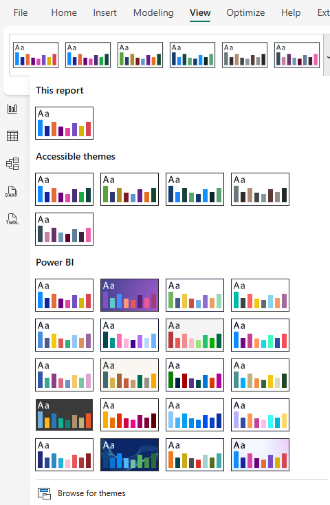
Now let’s embed this into a Power BI theme. If you’re already using a custom theme, you can add to it, or create a new one. Here’s a basic example with several icons:
One of the things I hear the most when running demos or working with customers.
“If I click on that KPI will that then filter the report”
Sadly, no. Or well not by default. Kick in Product Manager brain, make it work!
So in this blog post I will be running through my implementation of creating cards that can do exactly that, be clicked on, filter the rest of the report and fit nicely with the overall aesthetic I’ve built with Prism. We can also throw in some SVG animation to enhance everything visually and give it that extra level of polish.
So, how do we make KPI cards clickable?
Power BI doesn’t natively allow KPIs to act as slicers, so we need a workaround.
To be able to click and filter in PowerBI we have a few slicer options, but to make it look like a KPI card that’s when we need to consider some options:
We could:
Layer it (create a card and then add a dummy button slicer on top)
Use a Button Slicer
In this example, I’ve gone with the button slicer approach. It integrates cleanly into the overall product UI and is easier to manage as I evolve the design further.
The trick: SVG + Measures = Interactive KPI
In some previous posts, Ive used HTML / SVG with measures that we can then add to the image url field. Ive used the same logic here but then also added a state for Static, Hover and Selected. As we also need to think about making it obvious for end users to see we’ve added a filter.
Some subtle icons and animation can be really effective here
Tutorial
To start off:
Create a button slicer
Add the 3 different measures below
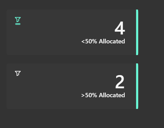
Below are my SVG measures. Each one displays a simple KPI-style card with a filter icon and adjusts styling such as colour and animation based on state (Static, Hover, Selected). The end result looks something like this:
Once you have added your button slicer and added the above measures, we need to apply them to the different states and ensure all looks and works as required.
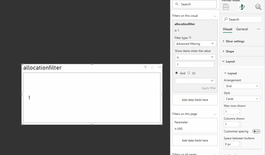
With the button slicer selected, first we need to add a field. This field needs to be what you are looking to filter on.
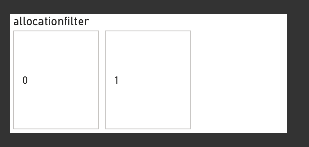
In my example, I used a calculated column linked to my table that was simply filtered on a 1 or 0 depending on the conditions – then linked to the wider data. (The data I used was looking at allocation rates, over 50% was a 1 everything else a 0)
Next:
On the filters if required set the filter on that visual to show what you are looking to filter on (i.e “1”)
Under layout, we need to show only the 1 row and column and I generally set the space between buttons as 0
Now to prepare for using the image measures we need to hide everything else
Under General
Disable Title
Disable Header Icons
Disable Effects / Background
Under Visual / Buttons
Disable Border
Disable Full
Padding – Set to custom and set all to 0 px
Under Callout Values
Disable Values
You should now essentially have a box that shows nothing!
Now back under visual / Image we need to apply the 3 measures – apply the following based on the state
All
Hover
Selected
HTML_Card_Filter
HTML_Card_Hover
HTML_Card_Selected
With all those added you should now have you Card Slicer!
Now you will need to use fields and titles that make sense to your data, those can all be changed within the measures themselves, just dont forget to change in all 3!
Once complete you should end up with something like the following:
Why This Matters
Beyond just looking nice, this pattern supports:
Design flexibility: Themed, responsive KPIs tailored to your report’s look and feel
Better UX: Users get clear, visual feedback
Faster interactions: No more guessing what’s clickable
Thanks for reading! As always I would love to hear from you, as well as any ideas you have!