Author: James Mounsey-Moran

  • Prevent scheduled refresh from being disabled due to inactivity

    Prevent scheduled refresh from being disabled due to inactivity

    When you use scheduled refresh in the Power BI service, it pauses if nobody accesses the report or dataset for 60 days. That’s fine from a load perspective, but if you want your datasets to always have the latest data and be available on demand, you’ll need to stop that from happening.

    Now there are some manual approaches such as creating a Subscription on each dataset within the service UI, but if we are putting our reports out at scale that just isn’t viable. So what we can do is build a PowerShell script that will loop through each of our datasets and prevent scheduled refresh from being disabled due to inactivity.

    The best way to achieve this is to trigger activity on the dataset. I do this by querying a table and column I know exist and discarding the result.

    For the full script, scroll down, but I’ll cover what it does and what bits you can change.

    When building the script, permissions can make it harder to directly access certain tables with PowerShell. If we know the exact name of the tables to try and a column within them then we access it directly.

    Firstly within this part of the code, choose a table within your dataset. When I was building I was checking for a couple of tables that had the same column name.

    #Select which tables exist in the datasets
    $tablesToTry = @(
        "######",
        "######"
    )

    Next, pick a column to query. I used [id] in my example.

    #Column to try within the tables
    $columnSuffix = "####"

    Lastly I had certain named datasets I wanted to query and some I wanted to exclude so that can be covered in this part of the code

    #Dataset names to include or exclude - blank returns all, separate with | for multiple
    $include = ""
    $exclude = ""

    Connect to Power BI

    The script starts by connecting to your Power BI account using:

    Connect-PowerBIServiceAccount
    

    If the connection fails, it stops and logs a warning. Once connected, the script can access all workspaces and datasets your account has permission to see.

    Gather Workspaces and Datasets

    It retrieves all your workspaces using:

    Get-PowerBIWorkspace -All
    

    Then, for each workspace, it lists all datasets. You can filter which datasets to include or exclude with simple patterns. For example:

    $include = "Sales|Finance"
    $exclude = "Test"
    

    Test Tables and Columns

    For each dataset, the script loops through a list of tables you specify:

    $tablesToTry = @("Orders", "Customers")
    $columnSuffix = "id"
    

    It builds a DAX query for each table/column combination, using TOPN to return a small sample. This keeps the load low while confirming the table exists and is accessible.

    Example query generated for the “Orders” table:

    EVALUATE
    TOPN(10, 'Orders', 'Orders'[id], DESC)

    Execute Queries via REST API

    The script runs the queries using the Power BI REST API:

    Invoke-PowerBIRestMethod -Url "datasets/$($dataset.Id)/executeQueries" -Method Post
    
    • If the query succeeds, it logs the dataset and table in $successfulDatasets and prints the rows.
    • If it fails, it captures the error and logs it in $failedDatasets for troubleshooting later.

    Trigger Report Usage

    For each dataset, the script looks for reports linked to it:

    Get-PowerBIReport -WorkspaceId $workspace.Id | Where-Object { $_.DatasetId -eq $dataset.Id }
    

    If a report is linked, the script exports it to PDF and discards the file. The export counts as usage and keeps the dataset active.

    Invoke-PowerBIRestMethod -Url "reports/$($report.Id)/ExportTo" -Method Post -Body (@{ format = "PDF" } | ConvertTo-Json)
    

    Logging and Results

    At the end, the script prints three tables:

    • ✅ Successfully queried datasets
    • ❌ Datasets that failed
    • 📊 Datasets where usage was triggered

    # ============================
    # POWERBI Trigger Usage
    # James Mounsey-Moran
    # ============================
    
    
    # ============================
    # CONFIGURATION
    # ============================
    
    
    #Select which tables exist in the datasets
    $tablesToTry = @(
        "######",
        "######"
    )
    
    
    #Column to try within the tables
    $columnSuffix = "####"
    
    #Dataset names to include or exclude - blank returns all, separate with | for multiple
    $include = ""
    $exclude = ""


    # ============================
    
    $daxQueryTemplate = @"
    EVALUATE
    TOPN(10, {0}, {1}, DESC)
    "@
    
    $failedDatasets     = @()
    $successfulDatasets = @()
    $usageTriggered     = @()
    
    # ============================
    # CONNECT TO POWER BI SERVICE
    # ============================
    try {
        Connect-PowerBIServiceAccount -ErrorAction Stop
    }
    catch {
        Write-Warning "Failed to connect to Power BI Service: $($_.Exception.Message)"
        return
    }
    
    # ============================
    # GET ALL WORKSPACES
    # ============================
    try {
        $workspaces = Get-PowerBIWorkspace -All -ErrorAction Stop
    }
    catch {
        Write-Warning "Failed to retrieve workspaces: $($_.Exception.Message)"
        return
    }
    
    foreach ($workspace in $workspaces) {
        Write-Output "`nProcessing workspace: $($workspace.Name) ($($workspace.Id))"
    
        try {
              $datasets = Get-PowerBIDataset -WorkspaceId $workspace.Id -ErrorAction Stop |
        Where-Object {
            (-not $include -or $_.Name -match "(?i)$include") -and
            (-not $exclude -or $_.Name -notmatch "(?i)$exclude")
        }
        }
        catch {
            Write-Warning "Failed to list datasets in workspace $($workspace.Name): $($_.Exception.Message)"
            continue
        }
    
        if ($datasets.Count -eq 0) {
            Write-Output "  No  datasets found. Skipping."
            continue
        }
    
        foreach ($dataset in $datasets) {
            Write-Output "  Processing dataset: $($dataset.Name) ($($dataset.Id))"
    
            $queriedSuccessfully = $false
            $tableErrors = @()
    
            foreach ($tableName in $tablesToTry) {
            $quotedTable = "'$tableName'"
            $columnName  = "$quotedTable[$columnSuffix]"
            $daxQuery    = [string]::Format($daxQueryTemplate, $quotedTable, $columnName)
    
                Write-Output "    Trying DAX: $daxQuery"
                try {
                    $response = Invoke-PowerBIRestMethod `
                        -Url "datasets/$($dataset.Id)/executeQueries" `
                        -Method Post `
                        -Body (@{
                            queries = @(@{ query = $daxQuery })
                            serializerSettings = @{ includeNulls = $true }
                        } | ConvertTo-Json -Depth 5) `
                        -ErrorAction Stop
    
                    $json = $response | ConvertFrom-Json
                    Write-Output "    ✅ Query successful for table $tableName."
                    $json.results[0].tables[0].rows | Format-Table
    
                    $queriedSuccessfully = $true
                    $successfulDatasets += [PSCustomObject]@{
                        Workspace = $workspace.Name
                        Dataset   = $dataset.Name
                        DatasetId = $dataset.Id
                        Table     = $tableName
                        Timestamp = Get-Date
                    }
    
                    break
                }
                catch {
                    $fullMsg = $_.Exception.ToString()
                    if ($fullMsg -match '"value":\s*"([^"]+)"') {
                        $errorMessage = $matches[1]
                    }
                    else {
                        $errorMessage = $_.Exception.Message
                    }
    
                    Write-Warning "    ❌ Failed for table $tableName $errorMessage"
                    $tableErrors += "Table $tableName $errorMessage"
                }
            }
    
            if (-not $queriedSuccessfully) {
                Write-Warning "  Could not query dataset $($dataset.Name) with any table."
                $failedDatasets += [PSCustomObject]@{
                    Workspace = $workspace.Name
                    Dataset   = $dataset.Name
                    DatasetId = $dataset.Id
                    Error     = ($tableErrors -join "; ")
                    Timestamp = Get-Date
                }
            }
    
            # ============================
            # REGISTER USAGE (EXPORT REPORT)
            # ============================
            try {
                $reports = Get-PowerBIReport -WorkspaceId $workspace.Id | Where-Object { $_.DatasetId -eq $dataset.Id }
                if ($reports.Count -gt 0) {
                    $report = $reports[0]  # just pick the first linked report
                    Write-Output "    Triggering usage via ExportTo on report: $($report.Name) ($($report.Id))"
    
                    $null = Invoke-PowerBIRestMethod `
                        -Url "reports/$($report.Id)/ExportTo" `
                        -Method Post `
                        -Body (@{ format = "PDF" } | ConvertTo-Json -Depth 3) `
                        -ErrorAction Stop
    
                    Write-Output "    ✅ Usage registered for dataset $($dataset.Name) via report $($report.Name)."
                    $usageTriggered += [PSCustomObject]@{
                        Workspace = $workspace.Name
                        Dataset   = $dataset.Name
                        Report    = $report.Name
                        Timestamp = Get-Date
                    }
                }
                else {
                    Write-Warning "    ⚠️ No report found linked to dataset $($dataset.Name). Cannot register usage."
                }
            }
            catch {
                Write-Warning "    ❌ Failed to trigger usage for dataset $($dataset.Name): $($_.Exception.Message)"
            }
        }
    }
    
    # ============================
    # REPORT SUCCESSFUL DATASETS
    # ============================
    if ($successfulDatasets.Count -gt 0) {
        Write-Output "`n✅ Successfully queried datasets:"
        $successfulDatasets | Format-Table -AutoSize
    }
    
    # ============================
    # REPORT FAILED DATASETS
    # ============================
    if ($failedDatasets.Count -gt 0) {
        Write-Output "`n❌ Datasets failed to query:"
        $failedDatasets | Format-Table -AutoSize
    }
    
    # ============================
    # REPORT USAGE REGISTRATION
    # ============================
    if ($usageTriggered.Count -gt 0) {
        Write-Output "`n📊 Usage registered for datasets:"
        $usageTriggered | Format-Table -AutoSize
    }
    else {
        Write-Output "`n⚠️ No usage registrations were made."
    }
    

    Once this is running, you won’t need to worry about refresh being paused after 60 days. The script keeps everything ticking over by simulating activity, so your datasets stay active and ready whenever you need them.
  • Animated Line Charts with Layering

    Animated Line Charts with Layering

    Creating Animated Line Charts in Power BI can be done in several ways. The most common approaches are using SVGs with measures and cards, or leveraging 3rd-party custom visuals that render HTML. While SVGs combined with a card look visually impressive, they often lose some of the interactivity we expect from native visuals such as tooltips.

    To solve this, we can combine native visuals with SVGs, layering them together to create animated line charts that retain interactivity.

    For this method, we’ll use:

    • A line chart supported by measures that provide the line itself plus space above and below it.
    • An animated SVG background placed behind the chart.

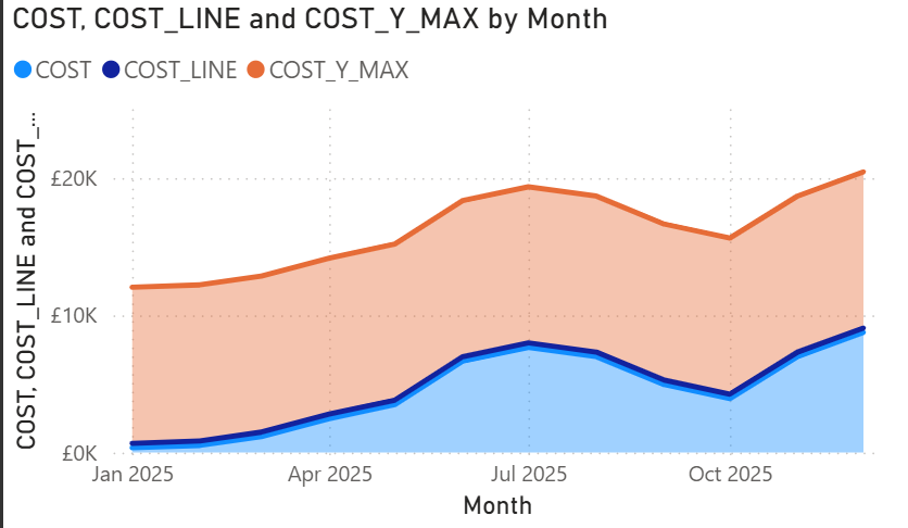
    For this example, we’ll use a dataset that tracks costs over time. We need three measures to build our animated line chart

    Measure 1 (The actual cost)

    This initial measure will simply be the actual value, so the cost column. In this instance I have just loaded into a measure called [COST]

    COST = SUM(ProductSales[Cost])

    Measure 2 (The Line)

    To create the line we want to highlight, we need it to sit just above the actual cost. We do this by creating a new measure that takes the cost for each date and returns 4% of it, making a thin but visible line on the chart.

    COST_LINE = MAXX(ALLSELECTED(ProductSales[Month]),[COST])*0.04

    Measure 3 (The top space)

    The final measure fills the remaining space on the Y axis. This makes the chart look full while leaving about 30% of space above the line. We implement this measure as follows

    COST_Y_MAX = MAXX(ALLSELECTED(ProductSales[Month]),[COST])*1.3

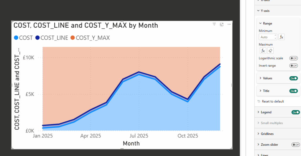
    With the measures in place, we can start building the visual. The steps below show how to use the measures to create the chart.

    • Add a Stacked Area Chart
    • On the Y axis, add the three measures in this order: COST, COST_LINE, COST_Y_MAX
    • On the X axis add a Date column from your dataset

    Once added, your chart should look something like the example below.

    Next, we need the COST_Y_MAX measure to fill the top part of the chart. To do this:

    • Select the visual and go to Y Axis, Range.
    • Set the maximum value to COST_Y_MAX.

    This ensures the chart fills the Y axis correctly and leaves space above the line.

    Now that we have the basic chart, it’s time to set up the visual elements that will support the layers behind it.

    • Select the visual and disable the legend.
    • Under X & Y Axis, disable the titles (optional if you don’t need them).
    • Under General, Background, choose a background color. In this example, I’ve used #292929. Make a note of this, as we’ll be turning the background off later.

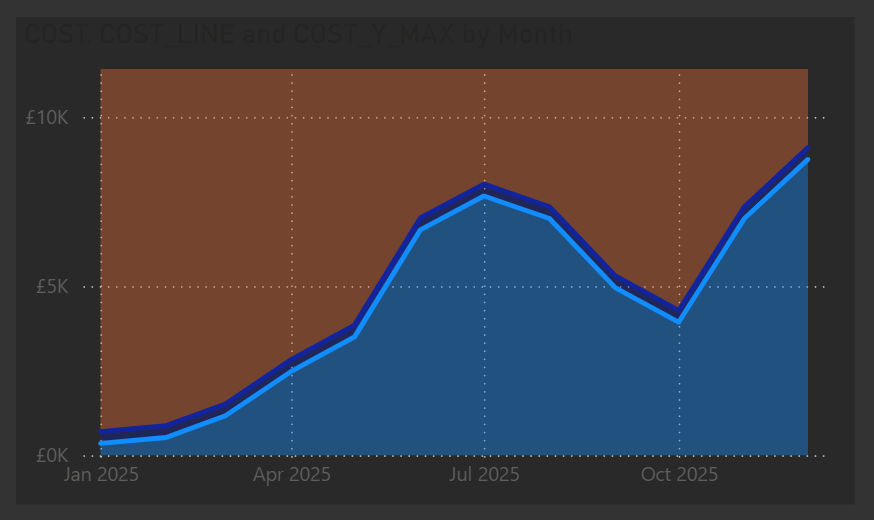
    After these changes, your visual should look something like this:

    Next we need to use that same background for our shade areas and lines

    • Under Lines
    • Select the COST_Y_MAX Series and untick show for this series
    • Select the COST Series and untick show for this series as well
    • Under Shade Area
    • Select the COST_Y_MAX Series, untick match line color
    • Set the Color to the same as your background color (e.g. #292929) and set transparency to 0%
    • Select the COST Series and again untick match line color
    • Set the Color to the same as your background color (e.g. #292929) but this time set transparency to 5%
    • Select the COST_LINE Series and uncheck Show for this Series

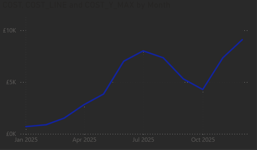
    That should now give us the following

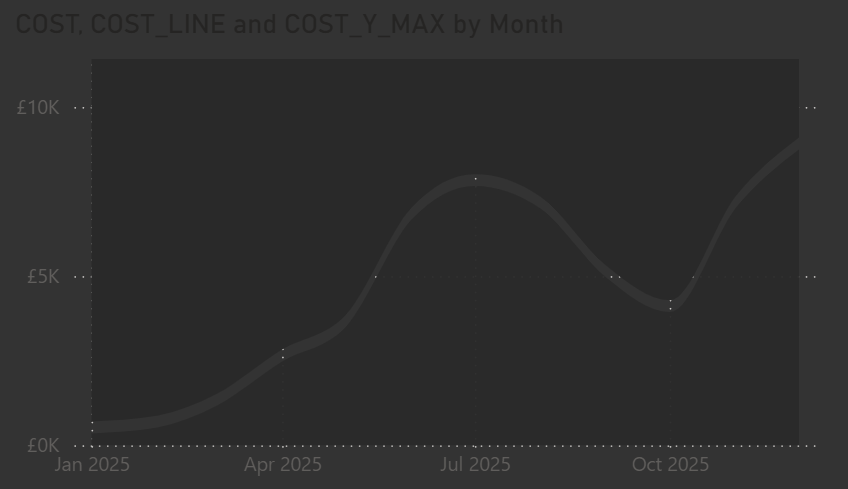
    Since we used the other measures to hide parts of the chart, the next step is to fully configure the line area we want to display.

    • Under Line, with Series All selected, set the Interpolation Type to Smooth and the Smooth type to Monotone.
    • Under Line, select COST_LINE and uncheck Show for this series.
    • Finally, go to General, Effects, Background and turn the background off.

    This prepares the chart so the animated SVG we’ll add behind it will show correctly.

    At this point, our visual is ready for the SVG animation to be added behind it.

    For the background, I’ve used the same dynamic SVG setup from a previous post, but applied a different animation in the measure. The steps below show the updated animation code.

    Next, we create a measure to generate the animated SVG background. This measure lets us pick different colors or gradients dynamically and animates a rectangle across the visual.

    HTML_Dynamic_Line = 
    VAR selectedOption =
        SELECTEDVALUE(BackgroundType[BackgroundType], "Light")
    
    VAR fillColor =
        SWITCH(
            TRUE(),
            selectedOption = "Light", "#F2EFE9",
            selectedOption = "Dark", "#1A1A1A",
            selectedOption = "Middle", "#A8A8A8",
            selectedOption = "Red", "#f03030",
            selectedOption = "Green", "#78C850",
            selectedOption = "Blue", "#6890F0",
            selectedOption = "Yellow", "#F8D030",
            selectedOption = "Orange", "#FFA500",
            selectedOption = "Gradient", "url(#red-yellow-green)",
            "#6BFAD8"
        )
    
    VAR svg =
        "<svg xmlns='http://www.w3.org/2000/svg' width='1920' height='1080' preserveAspectRatio='none' viewBox='0 0 1920 1080'>" &
    
        
        "   <defs>" &
        "       <linearGradient id='red-yellow-green' x1='0%' y1='100%' x2='0%' y2='0%'>" &
        "           <stop offset='0%' stop-color='#f03030'/>" &
        "           <stop offset='42%' stop-color='#f03030'/>" &
        "           <stop offset='46%' stop-color='#F8D030'/>" &
        "           <stop offset='54%' stop-color='#F8D030'/>" &
        "           <stop offset='58%' stop-color='#78C850'/>" &
        "           <stop offset='100%' stop-color='#78C850'/>" &
        "       </linearGradient>" &
    
        // Vignette definition
        "       <radialGradient id='vignette-gradient' cx='50%' cy='50%' r='75%' fx='50%' fy='50%'>" &
        "           <stop offset='0%' stop-color='black' stop-opacity='0'/>" &
        "           <stop offset='60%' stop-color='black' stop-opacity='0'/>" &
        "           <stop offset='80%' stop-color='#575757' stop-opacity='0.02'/>" &
        "           <stop offset='100%' stop-color='#575757' stop-opacity='0.08'/>" &
        "       </radialGradient>" &
        "   </defs>" &
    
        // Animated rectangle fill
        "   <rect width='0' height='1080' fill='" & fillColor & "'>" &
        "       <animate attributeName='width' from='0' to='1920' dur='3s' fill='freeze' />" &
        "   </rect>" &
    
        // Vignette overlay
        "   <rect width='1920' height='1080' fill='url(#vignette-gradient)'/>" &
    "</svg>"
    
    RETURN
    "data:image/svg+xml;utf8," & svg
    

    In this step we need to setup the card to be able to apply the measure. As with my other examples I have been using the new card visual.

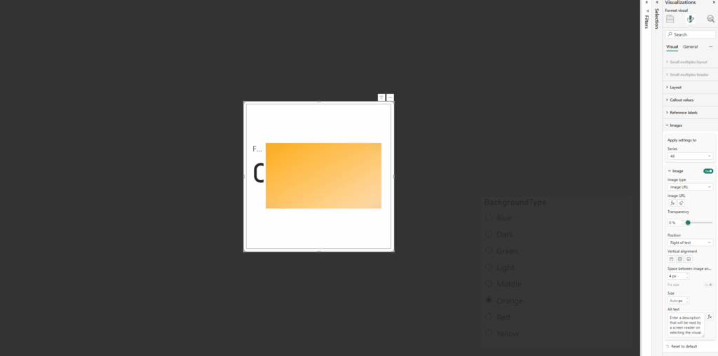
    Firstly, on the card, apply the measure under the image section.

    • Select Image URL
    • Select the measure
    • Add a column / value to the card to the Data parameter (any is fine we are going to remove this from view)

    Next we need to resize the card to the full size of the window (or at least the area wanting to use) and then disable the values / labels under the Callout values section:

    • Disable Values
    • Disable Label

    Now all padding needs to be removed from the card as well as removing all existing backgrounds / style effects

    Under Visual / Cards:

    • Disable Background
    • Disable Border
    • Change Padding to custom and set all to 0px

    Under Visual / Images

    • Change Space between Image and callout to 0px

    Under General / Effects

    • Disable Background
    • Under General / Properties
    • Set all Padding to 0px

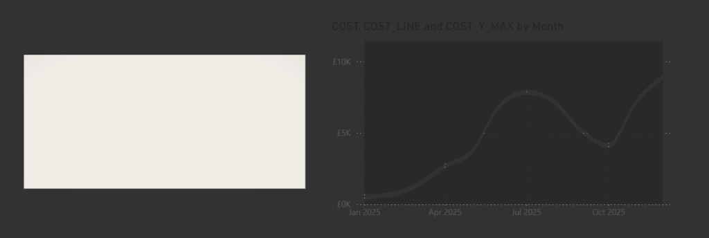
    Once added we should now have the two components, the visual we built and the card with the animated background

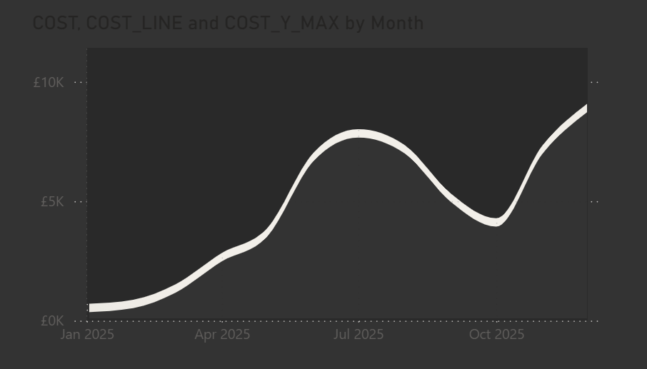
    Now for the fun part. We need to place the animated card behind the visual and resize it so it matches the border of the background color we applied to the top and bottom of the chart.

    Once positioned correctly, the animation will show through, and you may notice it animate a few times as you adjust the sizing.

    And that is it. Everything is in place. The visual, the animated background, and the measure controlling it. You can have the animation show a single color, a gradient, or any variation you like. I have tried a few different options myself as you might have seen on my LinkedIn.

    Once it was set up, I tidied the visual by adjusting the title and axes, turning off the gridlines, and adding a custom tooltip. Using the built-in tooltips would have shown all the extra measures we added, so the custom tooltip keeps it clean and focused.

  • Adding a dynamic and animated Clear Slicers SVG button

    Adding a dynamic and animated Clear Slicers SVG button

    In Power BI it’s not always obvious when slicers are still applied. Sure, you can clear them with a button but wouldn’t it be better if you had a HUD that told you at a glance and worked in a more dynamic fashion? That’s what we’ll build in this post, a dynamic and animated Clear Slicers SVG button!

    One of the main reasons for a HUD (heads up display) is to be able to quickly view the state of play. Now naturally as part of PowerBI we have multiple reports that utilise all sorts of filters and slicers applied to our data, and often have additional slicers on reports to change the data or filter on something specific.

    When using reports though, it can sometimes be difficult to know if a slicer is still applied and of course PowerBI has built in functionality to clear all slicers. This then became an ideal thing to display on a HUD.

    The ability to clear all applied is the easy part as I mentioned earlier, this is already part of PowerBI as button functionality. What we need is a measure to be able to detect when slicers are applied so we can use it as part of our SVG code (similar to when we are building cards and all the other fancy things built using SVG)

    The measure I’ve put together looks like this and how it works is pretty simple!

    FilterStateMonitor = 
    VAR TABLE_1 = IF(COUNTROWS(ALLSELECTED(table1)) < COUNTROWS(ALL('table1')), 1, 0)
    VAR TABLE_2 = IF(COUNTROWS(ALLSELECTED('table2')) < COUNTROWS(ALL('table2')), 1, 0)
    RETURN
    IF(TABLE_1 + TABLE_2 > 0, 1, 0)
    

    In this example I have just loaded in a couple of tables. If you have more you want to monitor then just add as additional VARs and add to the final IF statement.

    But essentially it:

    • Checks how many rows are currently selected out of the table
    • Compares this to the total rows in the table

    If this doesn’t match then it will set the variable to 1, or effectively flagging that a table is filtered.

    What we can do next is then use this as part of a SVG measure to control the icon on the HUD

    Here is my SVG (the layout may look similar to my base code in other blogs)

    HTML_FilterIcon = 
    
    VAR sizeWidth = 100
    VAR sizeHeight = 48
    
    -- Colors
    VAR baseColor = "#373737"
    VAR textColor = "#f5f5f5"
    
    -- SVG generation
    VAR svg = "
    <svg xmlns='http://www.w3.org/2000/svg' width='" & sizeWidth & "' height='" & sizeHeight & "' viewBox='0 0 " & sizeWidth & " " & sizeHeight & "'>
      <style>
          .pulse-stroke {
            stroke: #f5f5f5;
            animation: pulseStrokeAnim 2s infinite alternate;
          }
          @keyframes pulseStrokeAnim {
            0% { stroke: #f5f5f5; }
            100% { stroke: #B5F5F3; }
          }
      </style>
    
    
        <g transform='translate(34, 9) scale(2)'>
          <path class='pulse-stroke' d='M2 3h12l-4 4v4l-4 2V7L2 3z' stroke-width='1.5' fill='none' stroke-linecap='round' stroke-linejoin='round'/>
        </g>
    
        <g class='x-icon' transform='translate(60, 30) scale(0.8)'>
          <line x1='0' y1='0' x2='10' y2='10' stroke='#f5f5f5' stroke-width='3' stroke-linecap='round'/>
          <line x1='10' y1='0' x2='0' y2='10' stroke='#f5f5f5' stroke-width='3' stroke-linecap='round'/>
        </g>
    
    </svg>
    "
    
    RETURN 
    IF(
        [FilterStateMonitor] = 1,
        "data:image/svg+xml;utf8," & svg,
        BLANK()
    )
    

    This will draw an animated filter icon and as you can see at the bottom of the code only when our filter monitor is 1 (filter applied) will it then render the SVG.

    The SVG when drawn will look like the below and pulse between light blue and white (of course feel free to change these colours)

    Now we have a slicer monitor in a measure, and an SVG that is drawn only when our slicers are applied. This means the icon only appears when it’s actually needed

    Next we need to add the SVG to a card and if you follow my blog you should be used to this one by now

    As with my other examples I have been using the new card visual.

    Firstly, on the card, apply the measure under the image section.

    • Select Image URL
    • Select the measure
    • Add a column / value to the card to the Data parameter (any is fine we are going to remove this from view)

    Then resize the card to the size within our measure (in my example I have a width of 100px and height of 48px) and then disable the values / labels under the Callout values section:

    • Disable Values
    • Disable Label

    Next, remove all padding from the card and clear any existing backgrounds or style effects

    Under Visual / Cards:

    • Disable Background
    • Disable Border
    • Change Padding to custom and set all to 0px

    Under Visual / Images

    • Change Space between Image and callout to 0px

    Under General / Effects

    • Disable Background
    • Under General / Properties
    • Set all Padding to 0px

    At this point, the SVG is rendering in a card with no extra styling

    We have the SVG rendering on the screen, but its just a card, it can’t actually perform any actions. So now we need to layer an invisible button on top.

    Insert a new button and set the sizing to exactly match the size of our card containing the SVG. Place the button exactly on top of the card.

    Next, remove all the styling, so text, icons, fill, border, everything. It should be completely invisible.

    And lastly in the action section set the type to clear all slicers!

    Finally we have our button that not only looks good and shows up when needed but also clears all slicers in one click

    There we have it, a dynamic and animated clear all slicers button that looks great on our HUD, next let’s cover those buttons you may have seen on my LinkedIn!