Tag: svg

  • Creating Card Slicers in PowerBI

    Creating Card Slicers in PowerBI

    One of the things I hear the most when running demos or working with customers.

    “If I click on that KPI will that then filter the report”

    Sadly, no. Or well not by default. Kick in Product Manager brain, make it work!

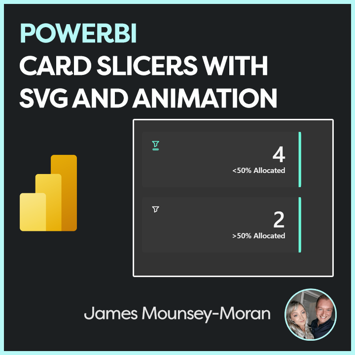
    So in this blog post I will be running through my implementation of creating cards that can do exactly that, be clicked on, filter the rest of the report and fit nicely with the overall aesthetic I’ve built with Prism. We can also throw in some SVG animation to enhance everything visually and give it that extra level of polish.

    So, how do we make KPI cards clickable?

    Power BI doesn’t natively allow KPIs to act as slicers, so we need a workaround.

    To be able to click and filter in PowerBI we have a few slicer options, but to make it look like a KPI card that’s when we need to consider some options:

    We could:

    • Layer it (create a card and then add a dummy button slicer on top)
    • Use a Button Slicer

    In this example, I’ve gone with the button slicer approach. It integrates cleanly into the overall product UI and is easier to manage as I evolve the design further.

    The trick: SVG + Measures = Interactive KPI

    In some previous posts, Ive used HTML / SVG with measures that we can then add to the image url field. Ive used the same logic here but then also added a state for Static, Hover and Selected. As we also need to think about making it obvious for end users to see we’ve added a filter.

    Some subtle icons and animation can be really effective here

    Tutorial

    To start off:

    • Create a button slicer
    • Add the 3 different measures below

    Below are my SVG measures. Each one displays a simple KPI-style card with a filter icon and adjusts styling such as colour and animation based on state (Static, Hover, Selected). The end result looks something like this:
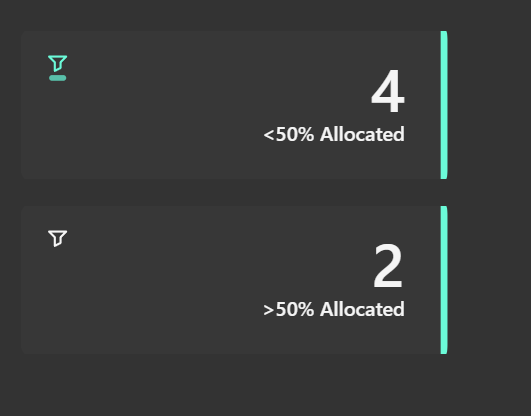
    HTML_Card_Filter = 
    
    VAR pct = COUNTROWS(
        FILTER(
            Sheet1,
            Sheet1[allocationfilter] = 1
        )
    )
    VAR sizeWidth = 300
    VAR sizeHeight = 110
    
    -- Colors
    VAR baseColor = "#373737"
    VAR textColor = "#f5f5f5"
    
    -- SVG generation
    VAR svg = "
    <svg xmlns='http://www.w3.org/2000/svg' width='" & sizeWidth & "' height='" & sizeHeight & "' viewBox='0 0 " & sizeWidth & " " & sizeHeight & "'>
      <style>
        .card-base {
          fill: " & baseColor & ";
        }
        .accent {
          fill: #6BFAD8;
        }
        .title {
          font-family: Segoe UI, sans-serif;
          font-size: 14px;
          font-weight: 600;
          fill: " & textColor & ";
          text-anchor: end;
        }
        .value {
          font-family: Segoe UI, sans-serif;
          font-size: 42px;
          font-weight: 600;
          fill: " & textColor & ";
          text-anchor: end;
        }
      </style>
    
      <!-- Background -->
      <rect class='card-base' width='" & sizeWidth & "' height='" & sizeHeight & "' rx='10' ry='10'/>
      
      <!-- Right accent -->
      <path class='accent' d='M " & (sizeWidth - 5) & " 0 L " & (sizeWidth - 5) & " " & sizeHeight & " Q " & sizeWidth & " " & sizeHeight & " " & sizeWidth & " " & (sizeHeight - 10) & " L " & sizeWidth & " 10 Q " & sizeWidth & " 0 " & (sizeWidth - 5) & " 0 Z'/>
      
      <!-- Filter icon in top left -->
      <g transform='translate(18, 18)'>
        <path d='M2 3h12l-4 4v4l-4 2V7L2 3z' stroke='" & textColor & "' stroke-width='1.5' fill='none' stroke-linecap='round' stroke-linejoin='round'/>
      </g>
    
      <!-- Text -->
      <text x='" & (sizeWidth - 30) & "' y='60' class='value'>" & pct & "</text>
      <text x='" & (sizeWidth - 30) & "' y='80' class='title'>&lt;50% Allocated</text>
    </svg>
    "
    
    RETURN "data:image/svg+xml;utf8," & svg
    
    HTML_Card_Filter_Hover = 
    
    VAR pct = COUNTROWS(
        FILTER(
            Sheet1,
            Sheet1[allocationfilter] = 1
        )
    )
    VAR sizeWidth = 300
    VAR sizeHeight = 110
    VAR animationKey = CONCATENATE("anim-", FORMAT(NOW(), "hhmmss"))
    
    -- Colors
    VAR baseColor = "#373737"
    VAR textColor = "#f5f5f5"
    
    -- SVG generation
    VAR svg = "
    <svg xmlns='http://www.w3.org/2000/svg' width='" & sizeWidth & "' height='" & sizeHeight & "' viewBox='0 0 " & sizeWidth & " " & sizeHeight & "'>
      <style>
        .card-base {
          fill: " & baseColor & ";
        }
        .accent {
          fill: #6BFAD8;
        }
        .title {
          font-family: Segoe UI, sans-serif;
          font-size: 14px;
          font-weight: 600;
          fill: " & textColor & ";
          text-anchor: end;
        }
        .value {
          font-family: Segoe UI, sans-serif;
          font-size: 42px;
          font-weight: 600;
          fill: " & textColor & ";
          text-anchor: end;
        }
        .animated-rect {
          fill: #6BFAD8;
          opacity: 0.7;
        }
      </style>
    
      <!-- Background -->
      <rect class='card-base' width='" & sizeWidth & "' height='" & sizeHeight & "' rx='10' ry='10'/>
      
      <!-- Right accent -->
      <path class='accent' d='M " & (sizeWidth - 5) & " 0 L " & (sizeWidth - 5) & " " & sizeHeight & " Q " & sizeWidth & " " & sizeHeight & " " & sizeWidth & " " & (sizeHeight - 10) & " L " & sizeWidth & " 10 Q " & sizeWidth & " 0 " & (sizeWidth - 5) & " 0 Z'/>
      
      <!-- Filter icon in top left -->
      <g transform='translate(18, 18)'>
        <!-- Static rectangle over filter icon -->
        <rect x='2' y='16' width='12' height='4' rx='2' class='animated-rect' data-anim='" & animationKey & "'/>
        <path d='M2 3h12l-4 4v4l-4 2V7L2 3z' stroke='" & textColor & "' stroke-width='1.5' fill='none' stroke-linecap='round' stroke-linejoin='round'/>
      </g>
    
      <!-- Text -->
      <text x='" & (sizeWidth - 30) & "' y='60' class='value'>" & pct & "</text>
    <text x='" & (sizeWidth - 30) & "' y='80' class='title'>&lt;50% Allocated</text>
    </svg>
    "
    
    RETURN "data:image/svg+xml;utf8," & svg
    
    
    HTML_Card_Filter_Selected = 
    
    VAR pct = COUNTROWS(
        FILTER(
            Sheet1,
            Sheet1[allocationfilter] = 1
        )
    )
    VAR sizeWidth = 300
    VAR sizeHeight = 110
    VAR animationKey = CONCATENATE("anim-", FORMAT(NOW(), "hhmmss"))
    
    -- Colors
    VAR baseColor = "#373737"
    VAR textColor = "#f5f5f5"
    
    -- SVG generation
    VAR svg = "
    <svg xmlns='http://www.w3.org/2000/svg' width='" & sizeWidth & "' height='" & sizeHeight & "' viewBox='0 0 " & sizeWidth & " " & sizeHeight & "'>
      <style>
        .card-base {
          fill: " & baseColor & ";
        }
        .accent {
          fill: #6BFAD8;
        }
        .title {
          font-family: Segoe UI, sans-serif;
          font-size: 14px;
          font-weight: 600;
          fill: " & textColor & ";
          text-anchor: end;
        }
        .value {
          font-family: Segoe UI, sans-serif;
          font-size: 42px;
          font-weight: 600;
          fill: " & textColor & ";
          text-anchor: end;
        }
        .animated-rect {
          fill: #6BFAD8;
          opacity: 0.9;
        }
        .pulse-glow {
          fill: none;
          stroke: rgba(255, 255, 255, 0.8);
          stroke-width: 1;
          opacity: 0;
        }
      </style>
    
      <!-- Background -->
      <rect class='card-base' width='" & sizeWidth & "' height='" & sizeHeight & "' rx='10' ry='10'/>
      <!-- Right accent -->
      <path class='accent' d='M " & (sizeWidth - 5) & " 0 L " & (sizeWidth - 5) & " " & sizeHeight & " Q " & sizeWidth & " " & sizeHeight & " " & sizeWidth & " " & (sizeHeight - 10) & " L " & sizeWidth & " 10 Q " & sizeWidth & " 0 " & (sizeWidth - 5) & " 0 Z'/>
      
      
      <!-- Filter icon in top left -->
      <g transform='translate(18, 18)'>
        <!-- Pulsing rectangle over filter icon -->
        <rect x='2' y='16' width='12' height='4' rx='2' class='animated-rect'>
          <animate attributeName='opacity' values='0.9;0.1;0.9' dur='1.5s' repeatCount='indefinite' begin='0s'/>
          <animate attributeName='fill' values='#6BFAD8;#4ECDC4;#6BFAD8' dur='1.5s' repeatCount='indefinite' begin='0s'/>
        </rect>
        <path d='M2 3h12l-4 4v4l-4 2V7L2 3z' stroke='#6BFAD8' stroke-width='1.5' fill='none' stroke-linecap='round' stroke-linejoin='round'/>
      </g>
    
      <!-- Text -->
      <text x='" & (sizeWidth - 30) & "' y='60' class='value'>" & pct & "</text>
    <text x='" & (sizeWidth - 30) & "' y='80' class='title'>&lt;50% Allocated</text>
    </svg>
    "
    
    RETURN "data:image/svg+xml;utf8," & svg
    

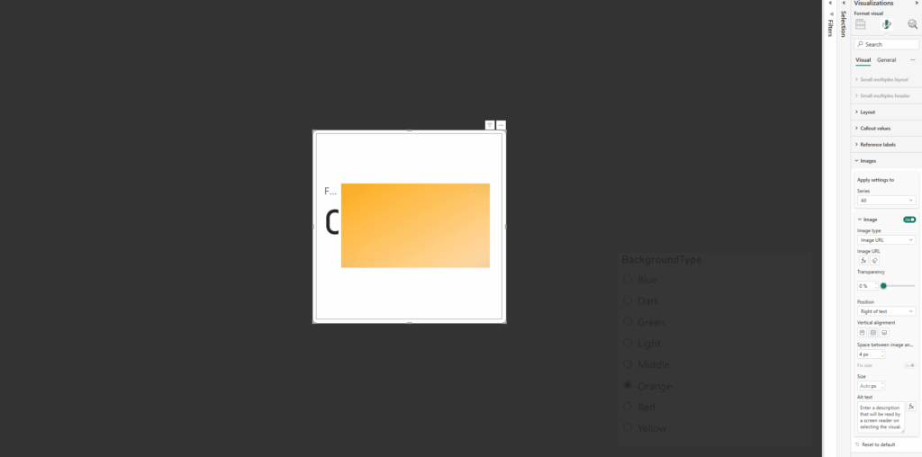
    Once you have added your button slicer and added the above measures, we need to apply them to the different states and ensure all looks and works as required.
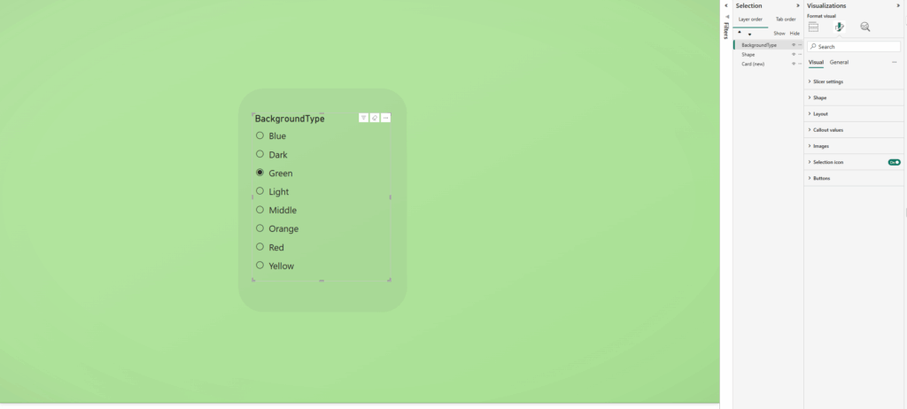
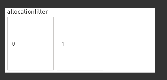
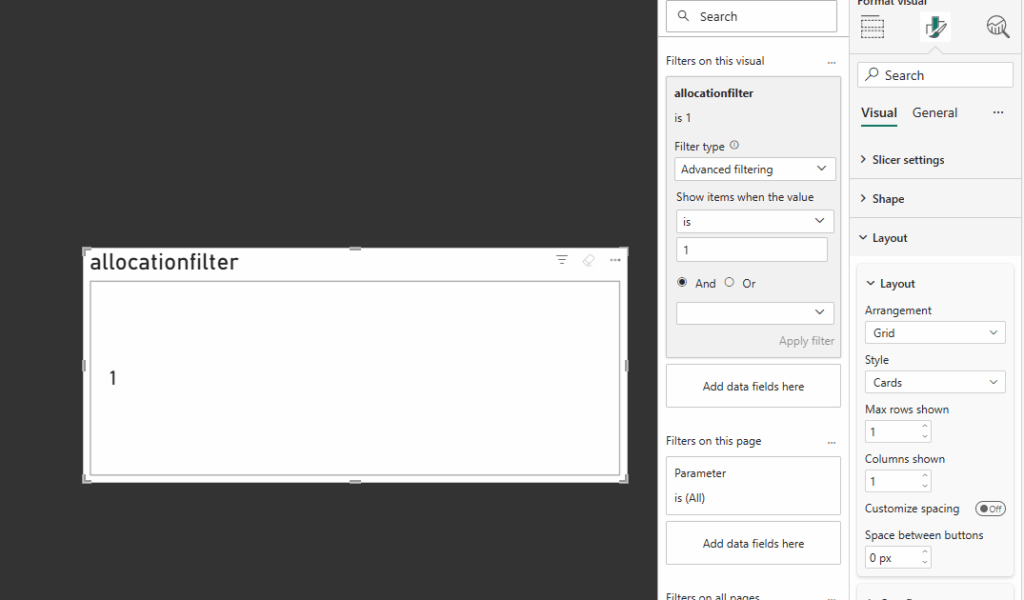
    In my example, I used a calculated column linked to my table that was simply filtered on a 1 or 0 depending on the conditions – then linked to the wider data. (The data I used was looking at allocation rates, over 50% was a 1 everything else a 0)

    Next:

    • On the filters if required set the filter on that visual to show what you are looking to filter on (i.e “1”)
    • Under layout, we need to show only the 1 row and column and I generally set the space between buttons as 0

    Now to prepare for using the image measures we need to hide everything else

    Under General

    • Disable Title
    • Disable Header Icons
    • Disable Effects / Background

    Under Visual / Buttons

    • Disable Border
    • Disable Full
    • Padding – Set to custom and set all to 0 px

    Under Callout Values

    • Disable Values

    You should now essentially have a box that shows nothing!

    Now back under visual / Image we need to apply the 3 measures – apply the following based on the state

    AllHoverSelected
    HTML_Card_FilterHTML_Card_HoverHTML_Card_Selected

    With all those added you should now have you Card Slicer!

    Now you will need to use fields and titles that make sense to your data, those can all be changed within the measures themselves, just dont forget to change in all 3!

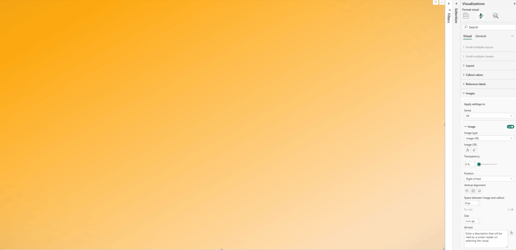
    Once complete you should end up with something like the following:

    Why This Matters

    Beyond just looking nice, this pattern supports:

    • Design flexibility: Themed, responsive KPIs tailored to your report’s look and feel
    • Better UX: Users get clear, visual feedback
    • Faster interactions: No more guessing what’s clickable

    Thanks for reading! As always I would love to hear from you, as well as any ideas you have!

  • Creating SVG Powered Navigation Buttons in PowerBI

    Creating SVG Powered Navigation Buttons in PowerBI

    Not every SVG needs to be used as a measure in Power BI. In some cases, it makes more sense to take a simpler approach and use .SVG files directly. This is especially helpful when working with buttons in Power BI, which currently do not support imageURL (like we would use in the new card visuals, for example) and instead only allow image input. Hopefully this blog post helps you with creating SVG powered navigation buttons in PowerBI.

    Thankfully, those image options give us all we need to make buttons more dynamic. You can use animated SVG icons or even animate the entire button if needed.

    Power BI buttons let you define multiple visual states, including Default, Hover, Selected etc. Each state can be customised with different settings for Text, Icon, Fill, and Border. Both Icon and Fill accept image files.

    SVG files can contain coded information, which means you can embed animation directly into them. You just need to make sure the .SVG file is correctly structured and works as expected inside Power BI.

    A useful tool for testing and previewing SVG files is https://www.svgviewer.dev.

    This example uses the Icon section of the button visual. Here, we apply an animated SVG that responds to the button state, such as when a user hovers over it.

    For this example, I am creating a simple arrow that moves up and down when the button is hovered over. We need two versions of the SVG. One will be static for the default state. The other will contain the animation for the hover state.

    Note: Make sure to include the namespace in your SVG. This is required for it to render correctly in Power BI.

    <?xml version="1.0" encoding="UTF-8" standalone="no"?>
    <svg 
       xmlns="http://www.w3.org/2000/svg"
    width="24" height="24" viewBox="0 0 24 24" fill="none" stroke="white" stroke-width="1" stroke-linecap="round" stroke-linejoin="round">
      <line x1="6" y1="18" x2="18" y2="6" />
      <polyline points="10 6 18 6 18 14" />
    </svg>
    <?xml version="1.0" encoding="UTF-8" standalone="no"?>
    <svg 
       xmlns="http://www.w3.org/2000/svg"
    width="24" height="24" viewBox="0 0 24 24" fill="none" stroke="white" stroke-width="1" stroke-linecap="round" stroke-linejoin="round">
      <g>
        <animateTransform
          attributeName="transform"
          type="translate"
          values="0 0; 1 -1; 2 -2; 3 -3; 4 -4; 0 0"
          keyTimes="0; 0.1; 0.25; 0.45; 0.8; 1"
          dur="2s"
          repeatCount="indefinite"
        />
        <line x1="6" y1="18" x2="18" y2="6" />
        <polyline points="10 6 18 6 18 14" />
      </g>
    </svg>

    Copy the code up to https://www.svgviewer.dev/ to preview, from here you can also download the .svg file as well which makes things nice and simple!

    Into PowerBI, Insert a new blank button, select the button to format at and under Style / Icon, choose Icon Type – Custom

    Next we need to apply the two image files, one for the default status and the other for hover

    Default

    • Under Style Apply Settings to: Firstly make the state as Default
    • Next, go back to the Icon section and apply the static SVG. I set the image fit as normal
    • Tweak the placement as required using alignment and padding ( I used left horizontal alignment, middle vertical, with padding of 10 on the left and 7 at the bottom.
    • I then set the icon size at 40, but against this can be tweaked as required

    Hover

    • This time under Style Apply Settings to: Switch to Hover
    • Back Under Icon, apply the animated svg. And set the image fit the same as your default setting (especially if using a similar icon for each)
    • If using the same icon like I have in this example ensure your placement and size matches the default settings
    • In my example I also added an extra border around the button, feel free to experiment and see what you like best!

    This example instead uses the Fill option of the button visual. Again, we apply an animated SVG that responds to the button state, such as when a user hovers over it but this time instead of affecting an icon, we can affect the button itself.

    For this example, a wave animation down the left hand side of the button that appears once hovered over. Unlike the icon example, we only need one SVG file this time as our default state for this example is just a solid fill background (just make sure your background matches the colour we are adding for the svg)

    Note: Make sure to include the namespace in your SVG. This is required for it to render correctly in Power BI.

    <svg xmlns="http://www.w3.org/2000/svg" width="259" height="74" viewBox="0 0 259 74">
      <style>
        .wave-accent {
          fill: #6bfad8;
          animation: waveMove 4s linear infinite;
        }
    
        @keyframes waveMove {
          0% { transform: translateY(0); }
          100% { transform: translateY(-160px); }
        }
      </style>
      <rect x="0" y="0" width="259" height="74" rx="6" ry="6" fill="#292929" />
      <defs>
        <clipPath id="waveClip">
          <rect x="0" y="0" width="25" height="74" />
        </clipPath>
      </defs>
      <g clip-path="url(#waveClip)">
        <g class="wave-accent">
          <path d="M12.5,0 q10,10 0,20 -10,10 0,20 10,10 0,20 -10,10 0,20 10,10 0,20 -10,10 0,20 10,10 0,20 -10,10 0,20 H0 V0 Z" />
          <path d="M12.5,160 q10,10 0,20 -10,10 0,20 10,10 0,20 -10,10 0,20 10,10 0,20 -10,10 0,20 10,10 0,20 -10,10 0,20 H0 V160 Z" />
        </g>
      </g>
    </svg>
    

    Copy the code up to https://www.svgviewer.dev/ to preview and download the .SVG file.

    Note this time, we have added the width and height in various parts of the code. This needs to match up with your size of the button in PowerBI to ensure if fills the whole area

    Into PowerBI, Insert a new blank button, select the button to format at and under Style / Icon, choose Icon Type – Custom

    Next we need to apply the single image file for the hover status

    Default

    • Under Style Apply Settings to: Ensure we are set on Default
    • Ensure the fill colour is set to exactly the same colour being used within your button
    • You may want to tweak the positioning of the text on your button, I applied middle horizontal and vertical alignment and then moved it around with padding

    Hover

    • Under Style Apply Settings to: Switch to Hover
    • Under Fill, browse and apply the animated svg. In this instance I’ve set the Image Fit just as Normal

    And that now should be it! You should have two different types of animated navigation buttons, you can apply the actions you need them to do down in the button settings and you are sorted!

    Please play around experiment with different types and shapes and of course share!

    Thanks for reading!

  • Dynamic PowerBI Backgrounds

    Dynamic PowerBI Backgrounds

    If you saw a couple of my posts on LinkedIn you would have seen some of the things I have been doing to mess with SVGs, HTML, animation and in this initial case Pokémon. I wanted to build a way to be able to seamlessly transition from one colour background to another but in a smooth and animated way driven by slicers, and all linked to dax measures. So, this blog post will give you a quick and easy way to achieve Dynamic PowerBI Backgrounds,

    Doing things this way means rather than relying on bookmarks, theme files to switch up colours or implement ideas such as dark mode we can instead add smooth transitions and make changes in a more dynamic way.

    Use SVG, HTML & CSS to enhance PowerBI reports – Home

    Firstly I configured the measure – this is currently linked to a simple table referencing the Background Type but this of course could be any of your values / data sets.

    I have created two sets of colours relating to the selected option to show the two ends of the gradient. This means when we apply the animation we gain a subtle effect (of course you could just use a simple base colour).

    To create a smoother transition between colours I have set all to initially show as a warm white colour, so instead of instantly performing a jarring switch, the screen goes light and slowly moves to the new selected colour. In my code I have also layered a slight vignette to the edges of the image to emphasise the display.

    As part of this code it is also important to select the correct width and height to ensure the effect fills the screen (set the same as your PBI reports or at least the same aspect ratio such as 1920×1080 if using 16:9)

    HTML_Dynamic_Back = 
    VAR selectedOption =
        // Get the selected background option, defaulting to "Light" if none is selected
        SELECTEDVALUE(BackgroundType[BackgroundType], "Light")
    
    VAR gradientStart =
        // Define gradient start colours for each option
        SWITCH(
            TRUE(),
            selectedOption = "Light", "#F2EFE9",  
            selectedOption = "Dark", "#1A1A1A",   
            selectedOption = "Middle", "#A8A8A8", 
            selectedOption = "Red", "#F08030",   
            selectedOption = "Green", "#78C850",  
            selectedOption = "Blue", "#6890F0",   
            selectedOption = "Yellow", "#F8D030", 
            selectedOption = "Orange", "#FFA500", 
            "#6BFAD8"                             
        )
    
    VAR gradientEnd =
        // Define gradient end colours for a lighter variation of each option
        SWITCH(
            TRUE(),
            selectedOption = "Light", "#FFFFFF",  
            selectedOption = "Dark", "#575757",   
            selectedOption = "Middle", "#D8D8D8", 
            selectedOption = "Red", "#FFD6C1",    
            selectedOption = "Green", "#E6FFE6",  
            selectedOption = "Blue", "#E6F5FF", 
            selectedOption = "Yellow", "#FFFFE0", 
            selectedOption = "Orange", "#FFE6CC", 
            "#FFFFFF"                             
        )
    
    VAR warmOffWhite = "#F2EFE9" // A warm off-white base colour
    
    VAR svg =
        // Construct the SVG with animated gradients and vignette effect
        "<svg xmlns='http://www.w3.org/2000/svg' width='1920' height='1080' preserveAspectRatio='none'>" &
        "   <defs>" &
        "       <linearGradient id='bg-gradient' x1='0%' y1='0%' x2='100%' y2='100%'>" &
        "           <stop offset='0%' stop-color='" & warmOffWhite & "'>" &
        "               <animate attributeName='stop-color' values='" & warmOffWhite & ";" & gradientStart & "' dur='4s' begin='0s' fill='freeze' repeatCount='1'/>" &
        "               <animate attributeName='stop-color' values='" & gradientStart & ";" & gradientEnd & ";" & gradientStart & "' dur='6s' begin='4s' repeatCount='indefinite'/>" &
        "           </stop>" &
        "           <stop offset='100%' stop-color='" & warmOffWhite & "'>" &
        "               <animate attributeName='stop-color' values='" & warmOffWhite & ";" & gradientEnd & "' dur='4s' begin='0s' fill='freeze' repeatCount='1'/>" &
        "               <animate attributeName='stop-color' values='" & gradientEnd & ";" & gradientStart & ";" & gradientEnd & "' dur='6s' begin='4s' repeatCount='indefinite'/>" &
        "           </stop>" &
        "           <animate attributeName='x1' values='0%; -20%; 0%; 20%; 0%' dur='15s' repeatCount='indefinite'/>" &
        "           <animate attributeName='y1' values='0%; -20%; 0%; 20%; 0%' dur='15s' repeatCount='indefinite'/>" &
        "           <animate attributeName='x2' values='100%; 120%; 100%; 80%; 100%' dur='15s' repeatCount='indefinite'/>" &
        "           <animate attributeName='y2' values='100%; 120%; 100%; 80%; 100%' dur='15s' repeatCount='indefinite'/>" &
        "       </linearGradient>" &
        "       <radialGradient id='vignette-gradient' cx='50%' cy='50%' r='75%' fx='50%' fy='50%'>" &
        "           <stop offset='0%' stop-color='black' stop-opacity='0'/>" &
        "           <stop offset='60%' stop-color='black' stop-opacity='0'/>" &
        "           <stop offset='80%' stop-color='#575757' stop-opacity='0.02'/>" &
        "           <stop offset='100%' stop-color='#575757' stop-opacity='0.1'/>" &
        "       </radialGradient>" &
        "   </defs>" &
        "   <rect width='1920' height='1080' fill='url(#bg-gradient)'/>" &
        "   <rect width='1920' height='1080' fill='url(#vignette-gradient)'/>" &
        "</svg>"
    
    RETURN
        "data:image/svg+xml;utf8," & svg

    In this step we need to setup the card to be able to apply the measure. As with my other examples I have been using the new card visual.

    Firstly, on the card, apply the measure under the image section.

    • Select Image URL
    • Select the measure
    • Add a column / value to the card to the Data parameter (any is fine we are going to remove this from view)

    Next we need to resize the card to the full size of the window (or at least the area wanting to use) and then disable the values / labels under the Callout values section:

    • Disable Values
    • Disable Label

    Now all padding needs to be removed from the card as well as removing all existing backgrounds / style effects

    Under Visual / Cards:

    • Disable Background
    • Disable Border
    • Change Padding to custom and set all to 0px

    Under Visual / Images

    • Change Space between Image and callout to 0px

    Under General / Effects

    • Disable Background
    • Under General / Properties
    • Set all Padding to 0px

    Now to test – I’ve added a slicer to switch between the different colours in my measure for example

    To get the best effect from the dynamic background I have set a level of transparency to the visuals (if not dynamically changing these colours too)

    Thanks for reading! Please have a play and let me know what cool things you make! Some actual use cases so far: enhancing UI / UX, a way to light mode / dark mode or accessibility options!