Tag: aether

  • Use SVG, HTML & CSS to enhance PowerBI reports

    Use SVG, HTML & CSS to enhance PowerBI reports

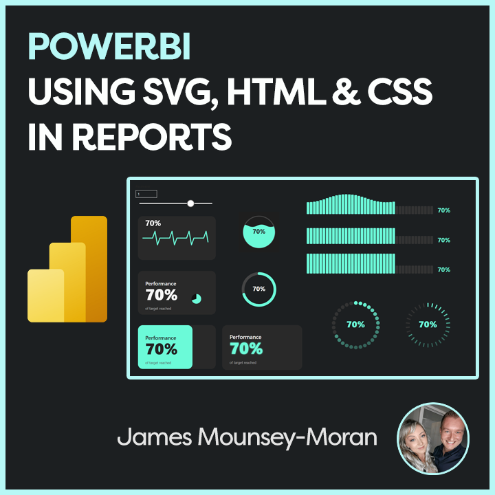
    HTML, CSS and SVGs are some of the things I know relatively well, Ive always messed around making games, animating or building apps out of various methods. In this case I wanted to understand how I can use SVG, HTML & CSS to enhance PowerBI reports.

    PowerBI whilst it has a lot of options in terms of its custom visuals, that same flexibility isnt always there. Difference is now you can use SVGs & HTML in tables, cards and all sorts just the same as if you were coding in a webpage. A lot of amazing content creators have already covered a lot of use cases for using HTML & SVG in things like tables. I wanted to do something a bit different, taking a look at those more traditional HTML methods I know for adding things like animation.

    What I have built out as part of this blog post can then be used as a base for building out pretty much anything when it comes to using SVGs and HTML. Throw in animation, changing colors anything you can think of.

    I love that these things also feed into my role as a Product Manager. I can dabble, play and find new ways to make UI / UX more exciting and engaging for my customers.

    Setting up the SVG / HTML Measure

    Firstly, for these initial cases I am just using the built in PowerBI visuals. To make this work we have to load the SVG / HTML in via a measure.

    I have created two base measures to cover common scenarios, depending on your needs (note we can not use JavaScript in either with PowerBI)

    • Using <foreignObject> to embed extended HTML and CSS inside SVG
    • Using pure SVG native elements

    FeatureSVG Native<foreignObject> (Extended HTML inside SVG)
    CSS SupportLimited to SVG and subset of CSSFull CSS including advanced layout, pseudo-elements
    Browser & tool supportVery broad, stableGood in modern browsers, less consistent in tools like Power BI
    Use casesSimple vector graphics, text, shapesComplex layouts, rich text formatting inside SVG
    PerformanceLightweight, fastSlightly heavier, potentially slower
    InteractivitySVG events and styling onlyCan use HTML events and richer interaction

    <foreignObject> Base

    HTMLBASE_FO = 
    
    -- Get the percentage value from a slicer or parameter table (assumes 0 to 1 scale)
    VAR pct = Parameter1[Parameter Value]
    
    -- Format the percentage as a whole number string with a "%" sign (e.g., "85%")
    VAR pctText = FORMAT(pct * 100, "0") & "%"
    
    -- Define the size of the SVG image
    VAR sizeWidth = 320
    VAR sizeHeight = 180
    
    -- Define dynamic colours
    VAR baseColor = "#292929"
    VAR textColor = "#f5f5f5"
    VAR subtitleColor = "#bbb"
    
    -- Build the HTML block for the foreignObject
    VAR svghtml = "
    <foreignObject x='0' y='0' width='" & sizeWidth & "' height='" & sizeHeight & "'>
      <div xmlns='http://www.w3.org/1999/xhtml'>
        <style>
          .card {
            width: 100%;
            height: 100%;
            background-color: " & baseColor & ";
            border-radius: 20px;
            padding: 24px;
            box-sizing: border-box;
            font-family: Segoe UI, sans-serif;
            display: flex;
            flex-direction: column;
            justify-content: center;
          }
          .title {
            font-size: 22px;
            font-weight: 600;
            color: " & textColor & ";
          }
          .value {
            font-size: 64px;
            font-weight: 900;
            color: " & textColor & ";
            margin-top: 4px;
          }
          .subtitle {
            font-size: 14px;
            color: " & subtitleColor & ";
            margin-top: auto;
          }
        </style>
        <div class='card'>
          <div class='title'>Title</div>
          <div class='value'>" & pctText & "</div>
          <div class='subtitle'>SubTitle</div>
        </div>
      </div>
    </foreignObject>
    "
    
    -- Wrap the foreignObject in an SVG
    VAR svg = "<svg xmlns='http://www.w3.org/2000/svg' width='" & sizeWidth & "' height='" & sizeHeight & "'>" & svghtml & "</svg>"
    
    -- Return the inline image
    RETURN "data:image/svg+xml;utf8," & svg

    SVG Native Base

    HTMLBASE_SVG = 
    VAR pct = Parameter1[Parameter Value]
    VAR pctText = FORMAT(pct * 100, "0") & "%"
    VAR sizeWidth = 320
    VAR sizeHeight = 180
    
    VAR baseColor = "#292929"
    VAR textColor = "#f5f5f5"
    VAR subtitleColor = "#bbb"
    
    VAR fillColor =
        SWITCH(
            TRUE(),
            pct < 0.2, "#E59EFB",
            pct > 0.8, "#F8FAB7",
            "#6bfad8"
        )
    
    
    -- SVG generation
    VAR svg = "
    <svg xmlns='http://www.w3.org/2000/svg' width='" & sizeWidth & "' height='" & sizeHeight & "' viewBox='0 0 " & sizeWidth & " " & sizeHeight & "'>
      <style>
        .card-base {
          fill: " & baseColor & ";
        }
        .title {
          font-family: Segoe UI, sans-serif;
          font-size: 22px;
          font-weight: 600;
          fill: " & textColor & ";
        }
        .value {
          font-family: Segoe UI, sans-serif;
          font-size: 64px;
          font-weight: 900;
          fill: " & textColor & ";
        }
        .subtitle {
          font-family: Segoe UI, sans-serif;
          font-size: 14px;
          fill: " & subtitleColor & ";
        }
      </style>
    
      <!-- Background -->
      <rect class='card-base' width='" & sizeWidth & "' height='" & sizeHeight & "' rx='20' ry='20'/>
    
      <!-- Text -->
      <text x='30' y='60' class='title'>Title</text>
      <text x='30' y='120' class='value'>" & pctText & "</text>
      <text x='30' y='160' class='subtitle'>SubTitle</text>
    
    </svg>
    "
    
    RETURN "data:image/svg+xml;utf8," & svg
    

    Adding the SVG / HTML Measure into a Card

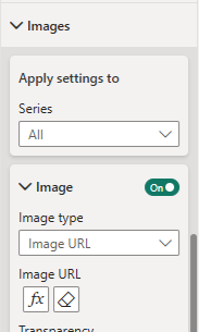
    Next, to use this measure I have been using it in the new card visual. Drop a card onto your dashboard – for the case of this code you will need to put any value into the Data field and then disable the callout value / label.

    Once added open the “Images” section on the card settings. Change the Image type to “Image URL” and select your new measure.

    Use SVG, HTML & CSS to enhance PowerBI reports

    Modifying for your own use case

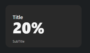
    Once you have this in place you should end up with something like this

    Now you change them around, build anything as long you keep the main building blocks of the code for SVG rendering.

    Eventually you can end up with all sorts of cool things such as the below. These are then all animated with various methods.
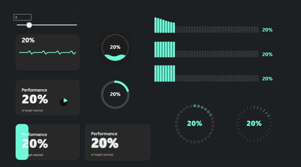
    Use SVG, HTML & CSS to enhance PowerBI reports

    A further example

    This code for example animated the bar in the top right with a wave effect

    HTML_Wave_Bar = 
    
    VAR pct = Parameter1[Parameter Value]
    VAR pctText = FORMAT(pct * 100, "0") & "%"
    
    VAR numBars = 40                        -- Added: number of bars for progress
    VAR barsToFill = ROUND(pct * numBars, 0)   -- Added: how many bars to fill based on pct
    
    
    VAR fillColor =                          -- Added: conditional bar color based on pct
        SWITCH(
            TRUE(),
            pct < 0.2, "#E59EFB",
            pct > 0.8, "#F8FAB7",
            "#6bfad8"
        )
    
    -- Added: Generate multiple bar divs with animation and staggered delay
    VAR barHTML = 
    CONCATENATEX (
        GENERATESERIES(1, numBars, 1),
        VAR i = [Value]
        VAR isFilled = i <= barsToFill
        VAR barColor = IF(isFilled, fillColor, "#333")
        VAR height = IF(isFilled, "100%", "40%")
        VAR animation = IF(isFilled, "waveBar 2.5s ease-in-out infinite", "none")
        VAR delay = FORMAT((i - 1) * 0.10, "0.00") & "s"
        VAR animationDelay = IF(isFilled, delay, "0s")
        RETURN "
            <div class='bar' style='
                background: " & barColor & ";
                height: " & height & ";
                animation: " & animation & ";
                animation-delay: " & animationDelay & ";
            '></div>"
    )
    
    -- Dimensions increased for full bar display (added larger SVG size)
    VAR sizeWidth = 1280
    VAR sizeHeight = 200
    
    -- Added: Style definitions including animation keyframes for bars and fade-in for label
    VAR svghtml = "
    <foreignObject x='0' y='0' width='" & sizeWidth & "' height='" & sizeHeight & "'>
    <div xmlns='http://www.w3.org/1999/xhtml'>
      <style>
        .container {
          font-family: Segoe UI, sans-serif;
          width: 90%;
          height: 150px;
          margin: auto;
          display: flex;                     
          align-items: flex-end;
          justify-content: flex-start;
          gap: 4px;                          
        }
        .bar {
          width: 20px;
          border-radius: 4px;
          transition: height 0.3s ease;      
        }
        .percentage-label {
          font-size: 48px;
          font-weight: bold;
          color: " & fillColor & ";          
          text-shadow: 0 0 6px rgba(0,0,0,0.3);
          margin-left: 30px;
          align-self: flex-end;
          animation: fadeIn 0.5s ease-in;   
        }
        @keyframes waveBar {               
          0%, 100% { height: 60%; }
          50% { height: 100%; }
        }
        @keyframes fadeIn {                 
          from { opacity: 0; transform: translateX(-10px); }
          to { opacity: 1; transform: translateX(0); }
        }
      </style>
      <div class='container'>
        " & barHTML & "                   
        <div class='percentage-label'>" & pctText & "</div>  
      </div>
    </div>
    </foreignObject>
    "
    
    -- Wrap in SVG and return as image (same concept, but bigger canvas for wave bars)
    VAR svg = "<svg xmlns='http://www.w3.org/2000/svg' width='" & sizeWidth & "' height='" & sizeHeight & "'>" & svghtml & "</svg>"
    
    RETURN "data:image/svg+xml;utf8," & svg

    Aether Repository – Use SVG, HTML & CSS to enhance PowerBI reports

    I have added these base sets of code to my Aether repo. So feel free to grab, comment and play. As I create some new animations and visuals, I will look to upload those as well

    https://github.com/AetherAdv/dax_htmlbase_FO

    https://github.com/AetherAdv/dax_htmlbase_SVG

  • Enhancing Your DevOps Reporting in Power BI

    Enhancing Your DevOps Reporting in Power BI

    My role in Product Management requires me to use DevOps a fair amount, lets just say I always have it open in one way or another. And whilst there are a number of tools out there these days to manage backlogs, roadmaps and everything else in between, it turns out DevOps and PowerBI were all I needed. This blog post focuses on enhancing your DevOps reporting in Power BI.

    The challenge

    The main connector in PowerBI to pull data from DevOps is perfect for getting started but it only pulls a basic set of data.

    The default connector for example if we take the Work Items – All history endpoint gives you the following:

    • Area Path
    • Assigned To
    • Iteration Path
    • Work Item Id
    • Title
    • State
    • Work Item Type
    • Data
    • is Current

    And this is generally fine if you want a quick view. But if you need to review priorities, further information under those user stories. All those useful data points that can make a much more effective dashboard, we need to go further.

    Luckily we can expand this data out using APIs by simply using this first initial connection as a base.

    The function

    In PowerBI if we add the following as a function thats queries the DevOps API directly, meaning we can then use the Work Item Id to get those extra details

    In the below Ive set DEVOPSORG and DEVOPSPROJECT as parameters matching up with my Organisation name and Project Name.

    https://github.com/AetherAdv/powerbi_product_devopsfunction

    let
        FetchWorkItemSummary = (workItemId as text) as table =>
        let
            // Compose the request URL with API version
            EndpointUrl = "https://dev.azure.com/DEVOPSORG/DEVOPSPROJECT/_apis/wit/workitems/" & workItemId & "?api-version=7.1-preview.3",
            
            // Attempt to retrieve JSON data from Azure DevOps
            RawResponse = try Json.Document(VSTS.Contents(EndpointUrl)) otherwise error "No details for ID " & workItemId,
            
            // Verify expected structure
            HasFieldsSection = if Record.HasFields(RawResponse, "fields") then RawResponse[fields] else error "Missing 'fields' data for item " & workItemId,
            
            // Pull out specific fields
            TaskPriority = Record.FieldOrDefault(HasFieldsSection, "Microsoft.VSTS.Common.Priority", null),
            TaskDescription = Record.FieldOrDefault(HasFieldsSection, "System.Description", null),
    
            // Convert to a table format
            Output = Table.FromRecords({
                [Priority = TaskPriority, Description = TaskDescription]
            })
        in
            Output
    in
        FetchWorkItemSummary

    As part of this code Ive then collected the Priority and the Description, so instantly gaining more useful information for reporting.

    There are of course more fields that we can then collect if needed. Use this table below to identify the field reference and drop into the function.

    Field NameField ReferenceNotes
    TitleSystem.TitleShort name of the work item
    StateSystem.StateCurrent workflow state (e.g. New, Active, Closed)
    Work Item TypeSystem.WorkItemTypeType (e.g., Bug, Task, Epic)
    Created BySystem.CreatedByUser who created the work item
    Created DateSystem.CreatedDateWhen the item was created
    Changed BySystem.ChangedByLast user who changed it
    Changed DateSystem.ChangedDateWhen the item was last updated
    Assigned ToSystem.AssignedToCurrent assignee
    TagsSystem.TagsComma-separated string of tags
    Area PathSystem.AreaPathHierarchical area assignment
    Iteration PathSystem.IterationPathSprint or iteration it belongs to
    Effort / Story PointsMicrosoft.VSTS.Scheduling.StoryPointsOften used for estimation
    Remaining WorkMicrosoft.VSTS.Scheduling.RemainingWorkTypically used in Tasks
    PriorityMicrosoft.VSTS.Common.PriorityUsed for sorting/backlog
    SeverityMicrosoft.VSTS.Common.SeverityOften used in bugs
    DescriptionSystem.DescriptionFull rich-text description

    Why?

    This data now forms the basis of dashboards I and other stakeholders rely on when reviewing the backlog, keeping up to date on the road map and much more. Enhancing your DevOps reporting in Power BI means we can get the extra fields we need for stronger reporting capability.

    Coming Next

    Next up I will show some of this data in some of the dashboards I use today, how I’m continuously improving them to support better decision making and how you can also looking to use them in your own environment.

  • Building a game with AI – Microsoft Copilot – Day 1

    Building a game with AI – Microsoft Copilot – Day 1

    Building a game with AI – Microsoft Copilot

    Over the past few months, I’ve been teaching my kids about AI, mainly through making pictures and songs. They’ve been in stitches as they have songs made up about them in the most ridiculous ways and they have started to understand roughly what AI can do.

    But we hadn’t gone as far as building a game, until now!

    We started with Microsoft Copilot, and the first game probably took less than 30 minutes!


    It all started with a simple request to Copilot. I said to the kids “ask Copilot for game ideas that can be built using HTML, CSS, and JavaScript” I wasn’t sure what we would get, but it gave us loads of ideas.

    Copilot didn’t just give us some basic ideas. Instead, it helped us get a framework for a racing game. A simple, yet exciting project that we could expand upon and suddenly it was their game.


    Once we had the foundation, the real fun began. The kids decided what they wanted to change, what they wanted to add, and what features would make the game their own.

    We started with the basics: a car driving around a simple race track. From there, every idea was coming together all with the help of AI. They wanted to customize the car, change the environment, all sorts. They were learning to modify the code in real-time and seeing immediate results, which was awesome to be fair (I did Games Dev at Uni and this part used to take ages!)


    The best part about this whole experience was how they kept tweaking and adding new features to the game. Every time they played, new ideas would pop up. For example, they asked, “Can it rain? Or snow? Or thunder?” So, we started adding weather effects. “Let’s make the car change colour!” Press C to make that happen, of course. And, naturally from my daughter: “I want it to leave rainbows when I drive!” (Press R for that).

    Watching them interact with the game, come up with ideas, and then modify it on their own was absolutely fantastic. It felt like the modern version of those “teach kids to code” programs they do at school, but with the ability to chat with AI, boost their understanding of the code and implement it.

    I uploaded the game to linkedin. I could already see their faces light up at the thought that someone else, maybe thousands of people, could play the game they built. For a 10-year-old, that’s a huge deal!


    The kids are already thinking of ways to improve it, and new features keep coming up. It’s been incredible to see their passion and the way they’ve embraced coding, technology, and AI in such a hands-on way. So I will keep track of how things change, what new things they learn. Questions they ask about AI. AI especially GenAI feels relatively new and exciting for us now, but it will be fully part of their future.

    It’s a reminder of just how powerful AI tools like Copilot can be for creativity and learning. It’s not just about summarising Teams meetings or writing documents it’s about sparking imaginations and helping kids learn through play.

    If you’re thinking of starting a project like this, I highly recommend it. We started with a simple prompt:
    “Give me game ideas that you can build using HTML, CSS, and JavaScript.”

    What happens next is incredible. Watch your kids learn, play, and create something amazing and in no time, they’ll be adding their own ideas to the mix.

    Turns out I am now Product Managing my kids!

    https://www.linkedin.com/posts/james-mounsey-moran-59488b98_ai-microsoftcopilot-gaming-activity-7318201278755442689-szmD?utm_source=share&utm_medium=member_desktop&rcm=ACoAABTGdYABhpaHAbZ6MKcnJPBg7C37ZicFkq8

    What they have added so far, just from prompts to Copilot

    • Car controlled by the arrow keys
    • Racing track following a random path (white lines in the middle of the road)
    • Press C to change car color
    • Car will leave tread marks when turning
    • Car with leave rainbow treads when pressing R
    • Track turns pink when pressing P
    • Weather effects will fade in randomly for a random time (Clear, rain, snow, thunderstorm)

    More coming soon!